Loanova
Fintech brand system

Overview
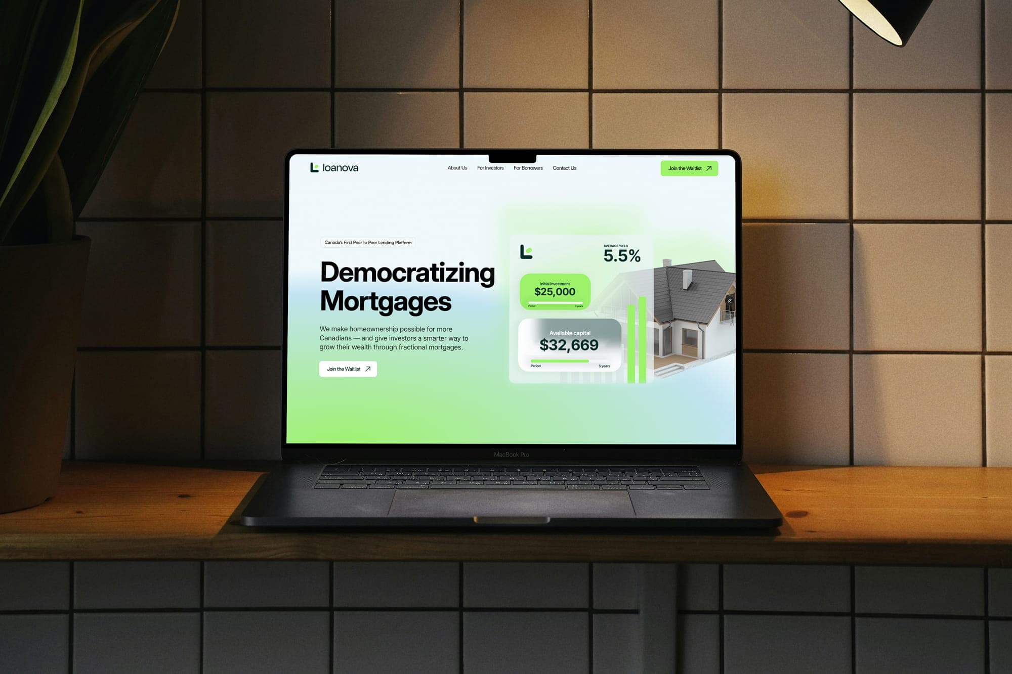
Loanova presents lending in a way that feels clear, modern, and genuinely helpful. The identity blends confidence with a calm, approachable tone, moving away from the stiff feel most financial brands lean on. It sets the stage for a platform that guides people with ease, not pressure.

Approach
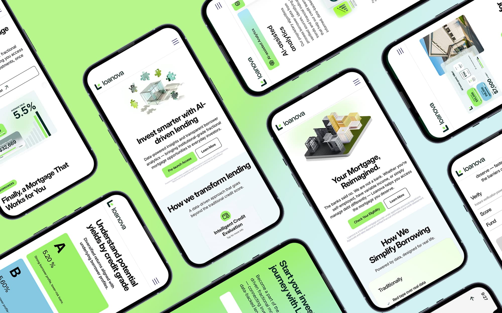
The result is a modern brand identity with clean geometry, a sense of movement, and a quiet hint toward the scoring engine without anything literal. It feels contemporary and intentional, built to signal trust, progress, and a smarter way to approach personal finance.


Outcome
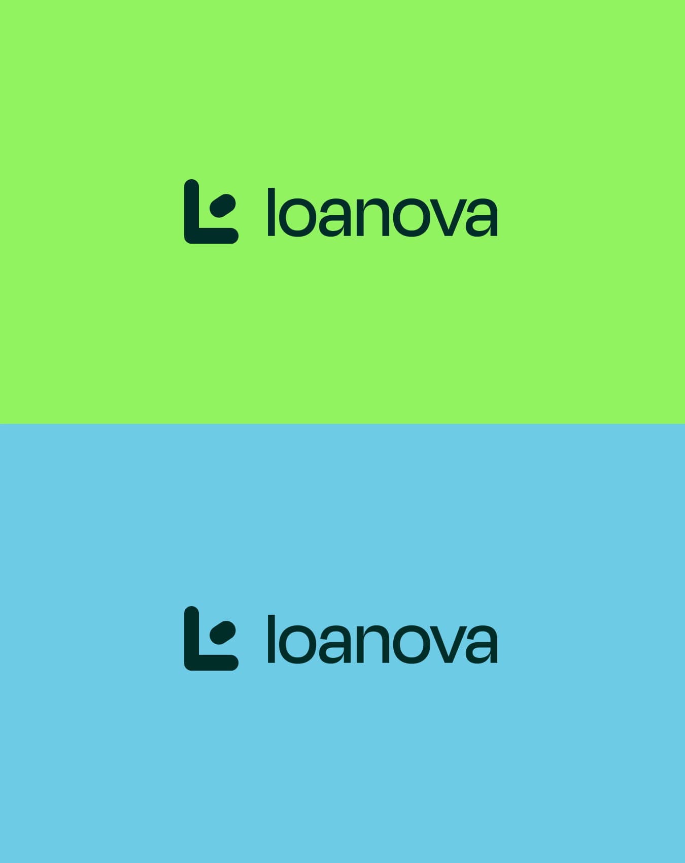
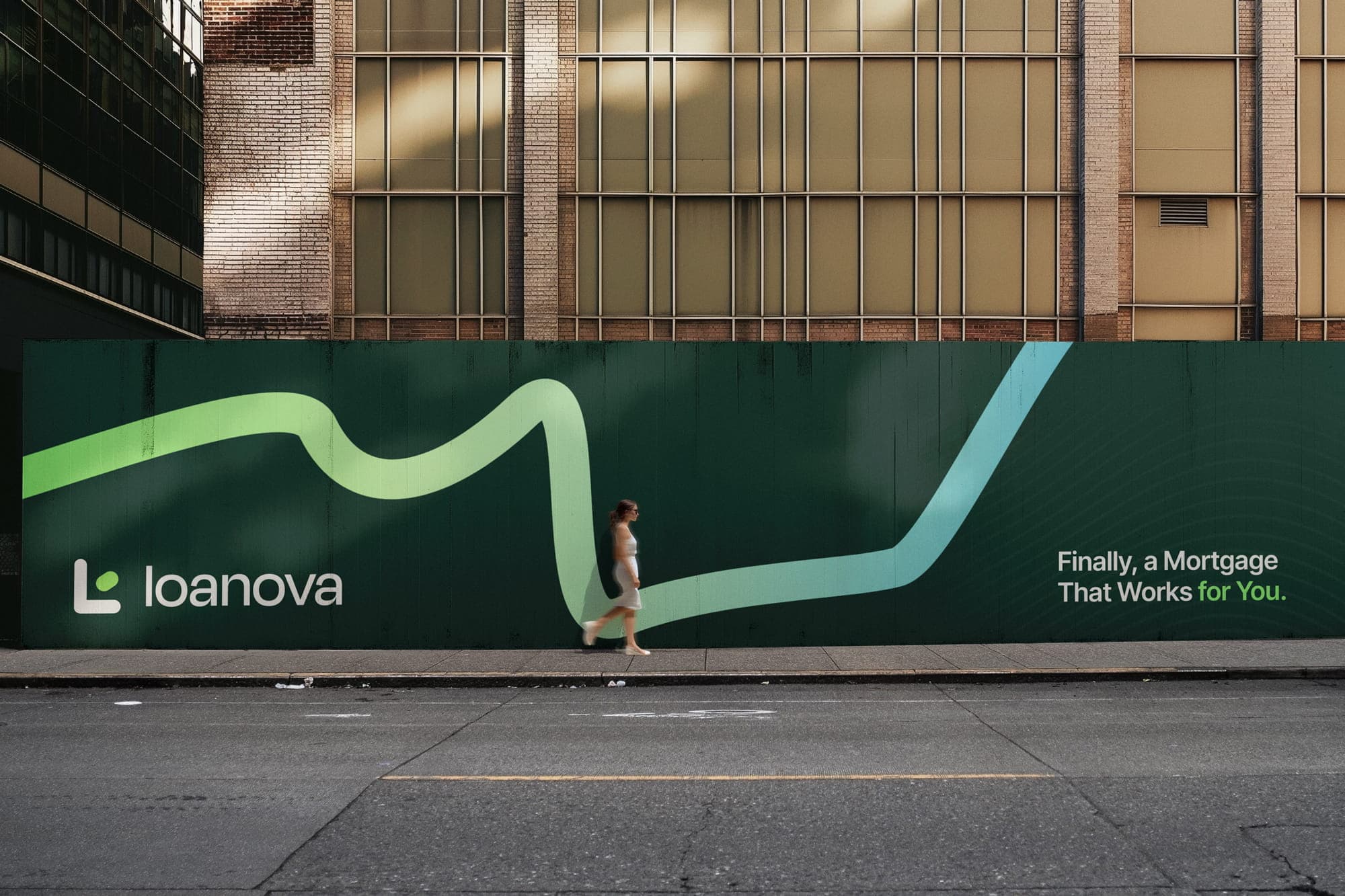
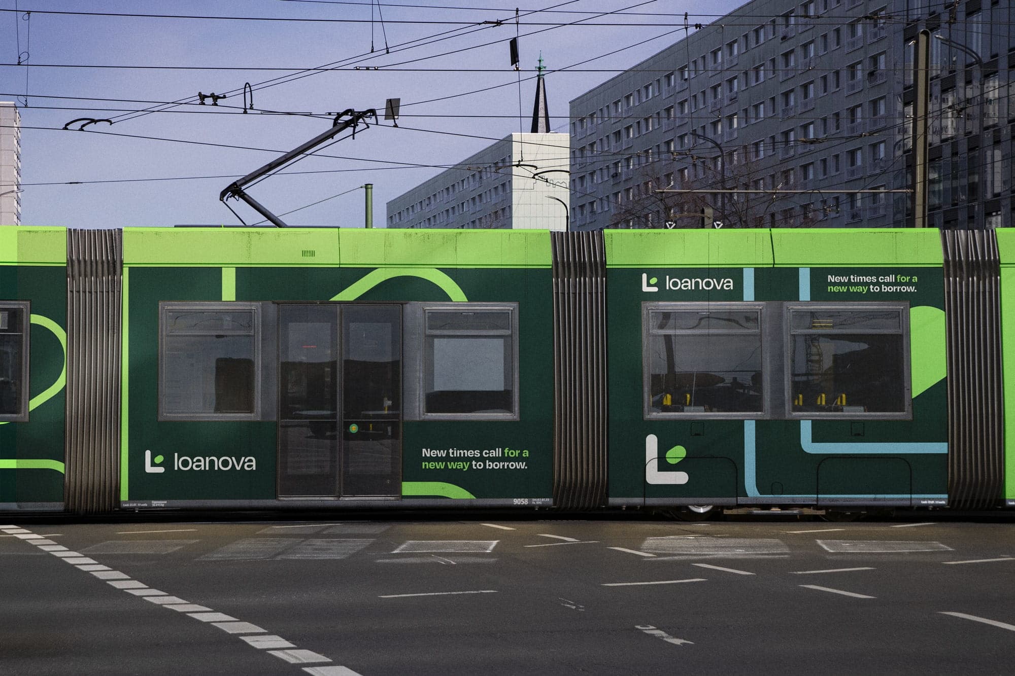
Loanova came away with an identity that does the reassuring for them. A soft-cornered L with a dot of green tucked inside it. A palette of deep forest and bright lime that reads as growth, not money. Type that says what it means. The system holds from a mortgage screen on a phone to the side of a tram rolling through the city, and none of it feels like paperwork.
Product
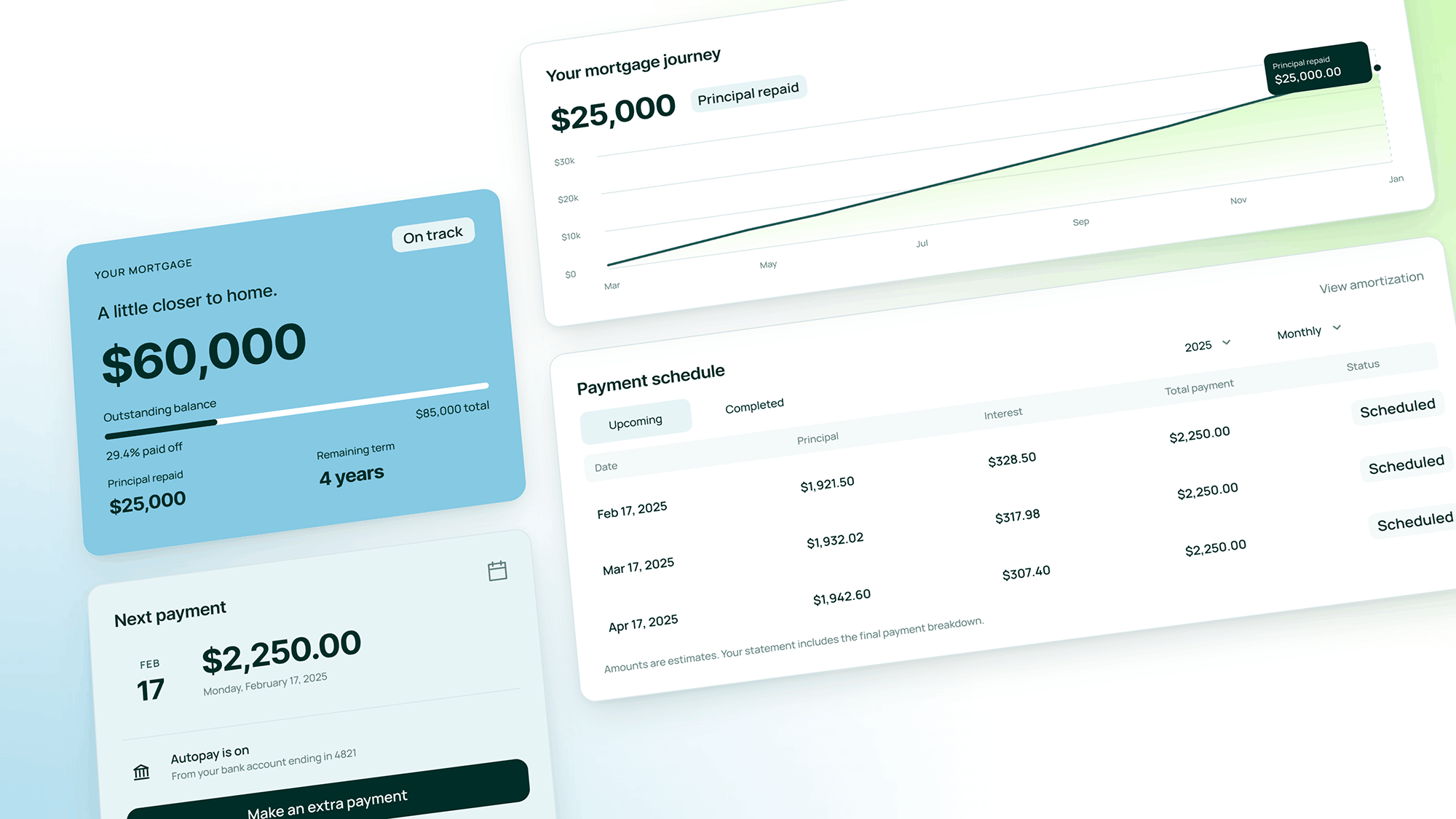
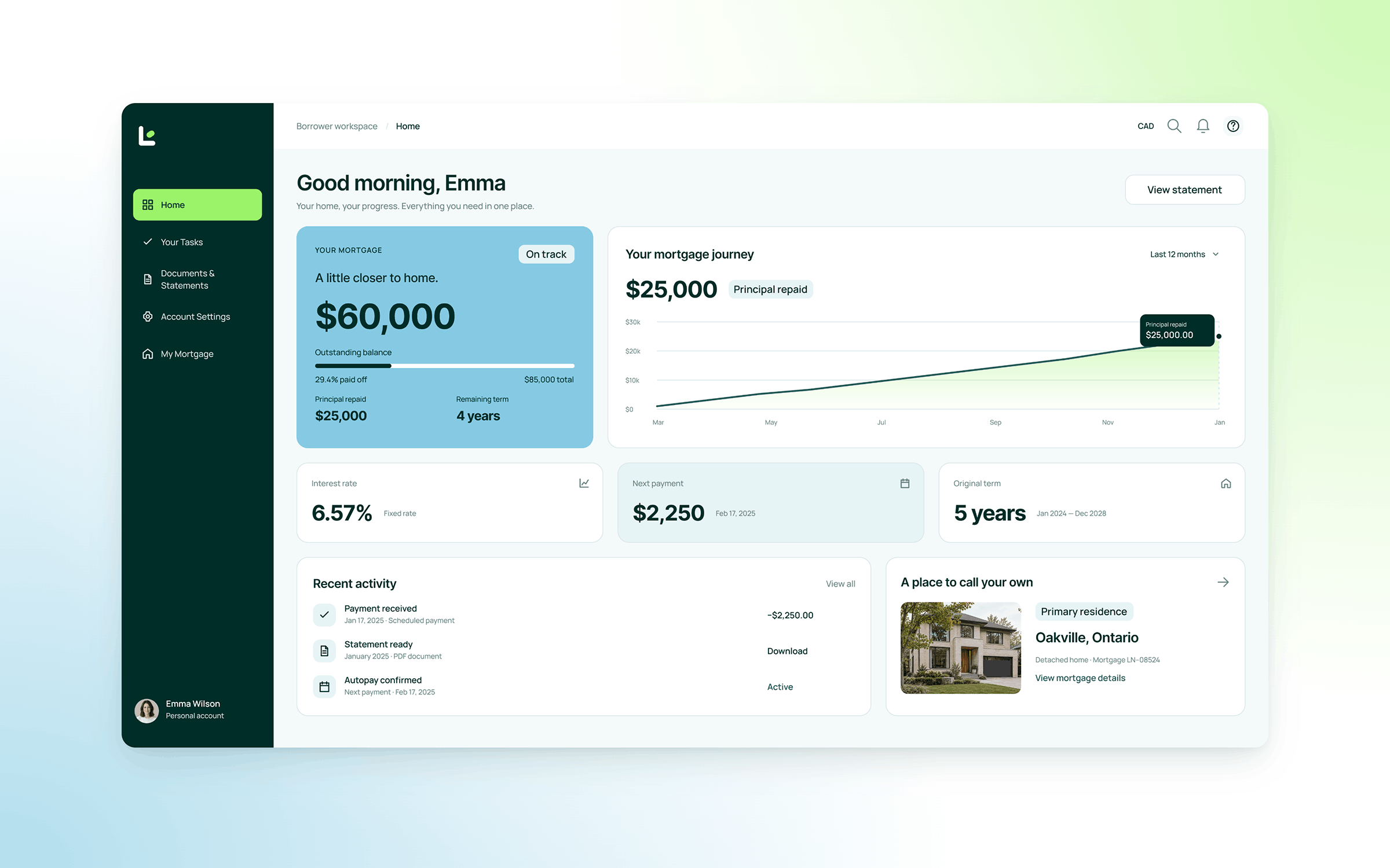
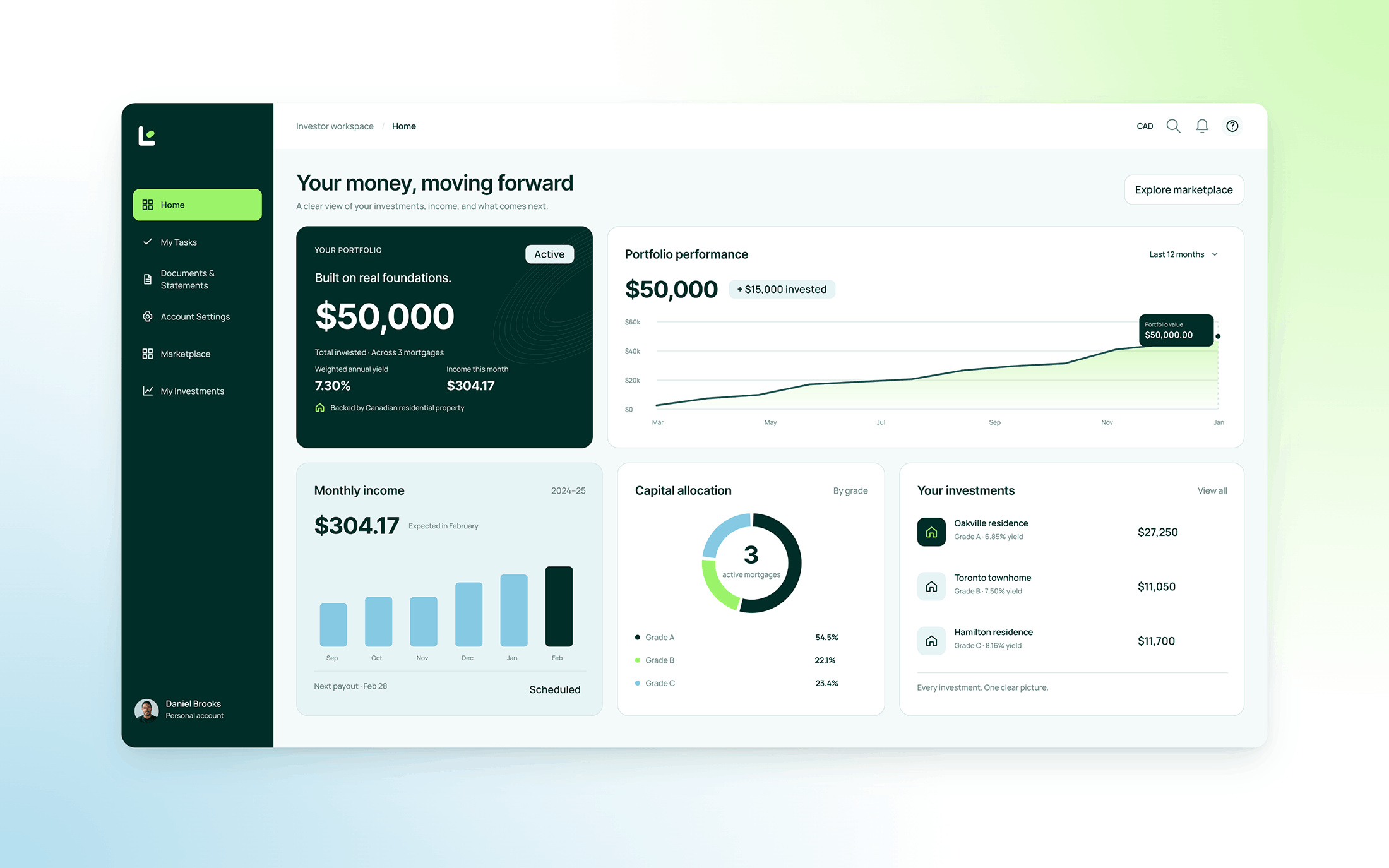
I design an interface the way I build a brand. Find the one thing that has to land, then clear out everything that fights it. With money, that one thing is usually a question people are nervous to ask.
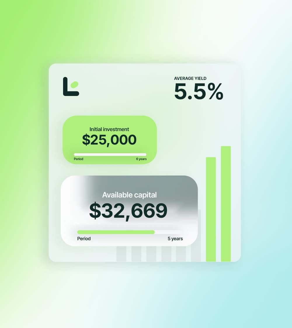
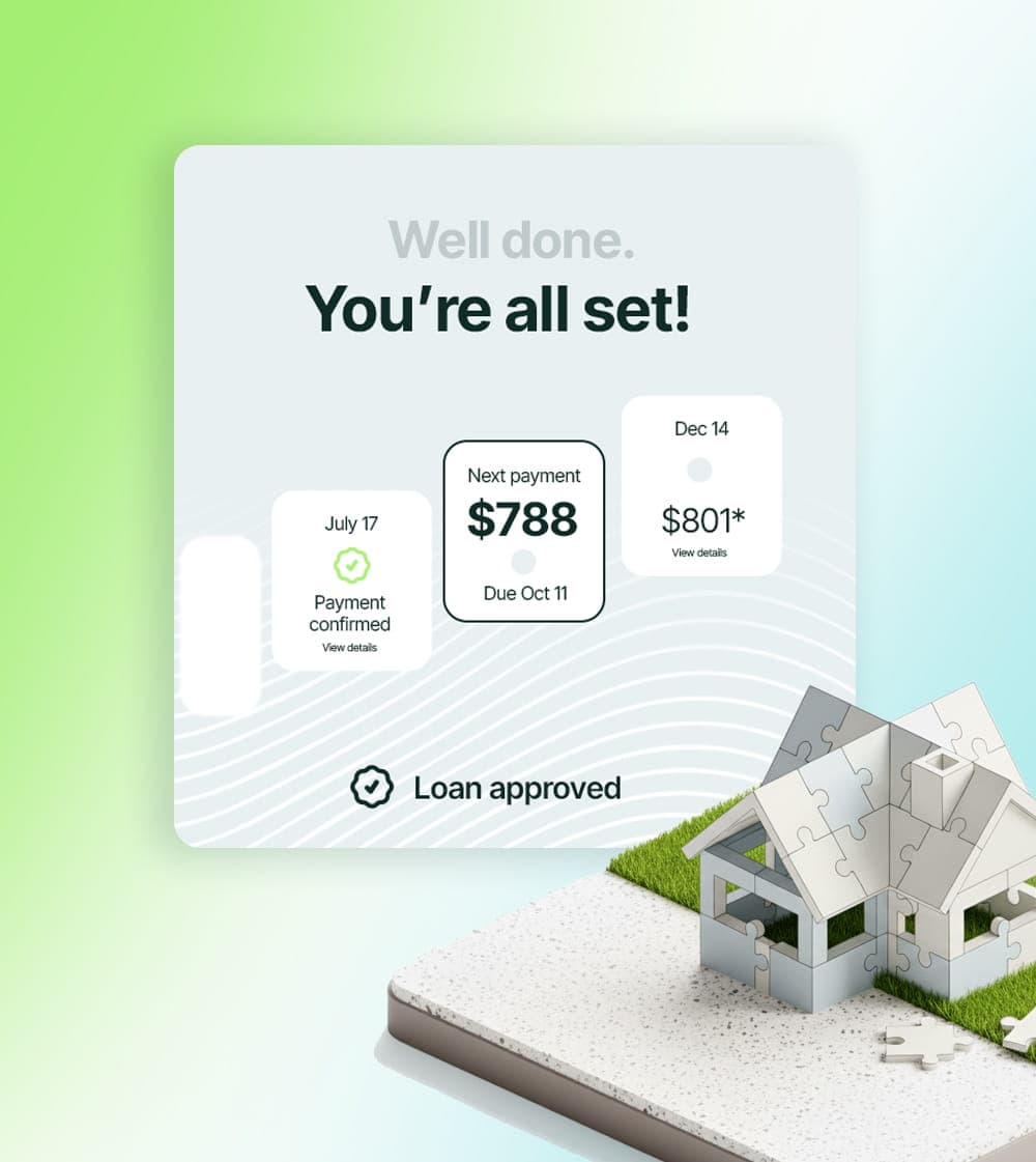
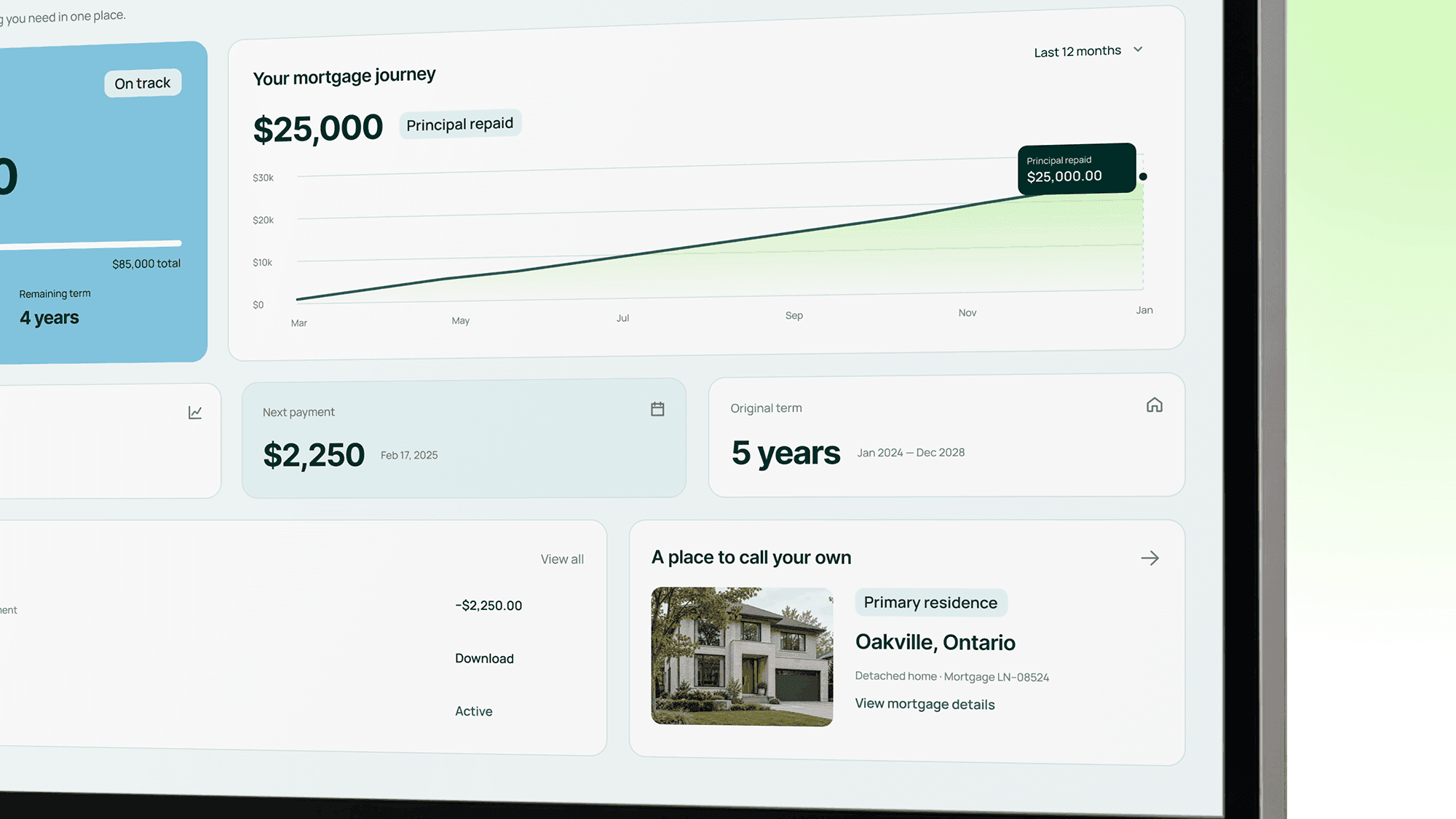
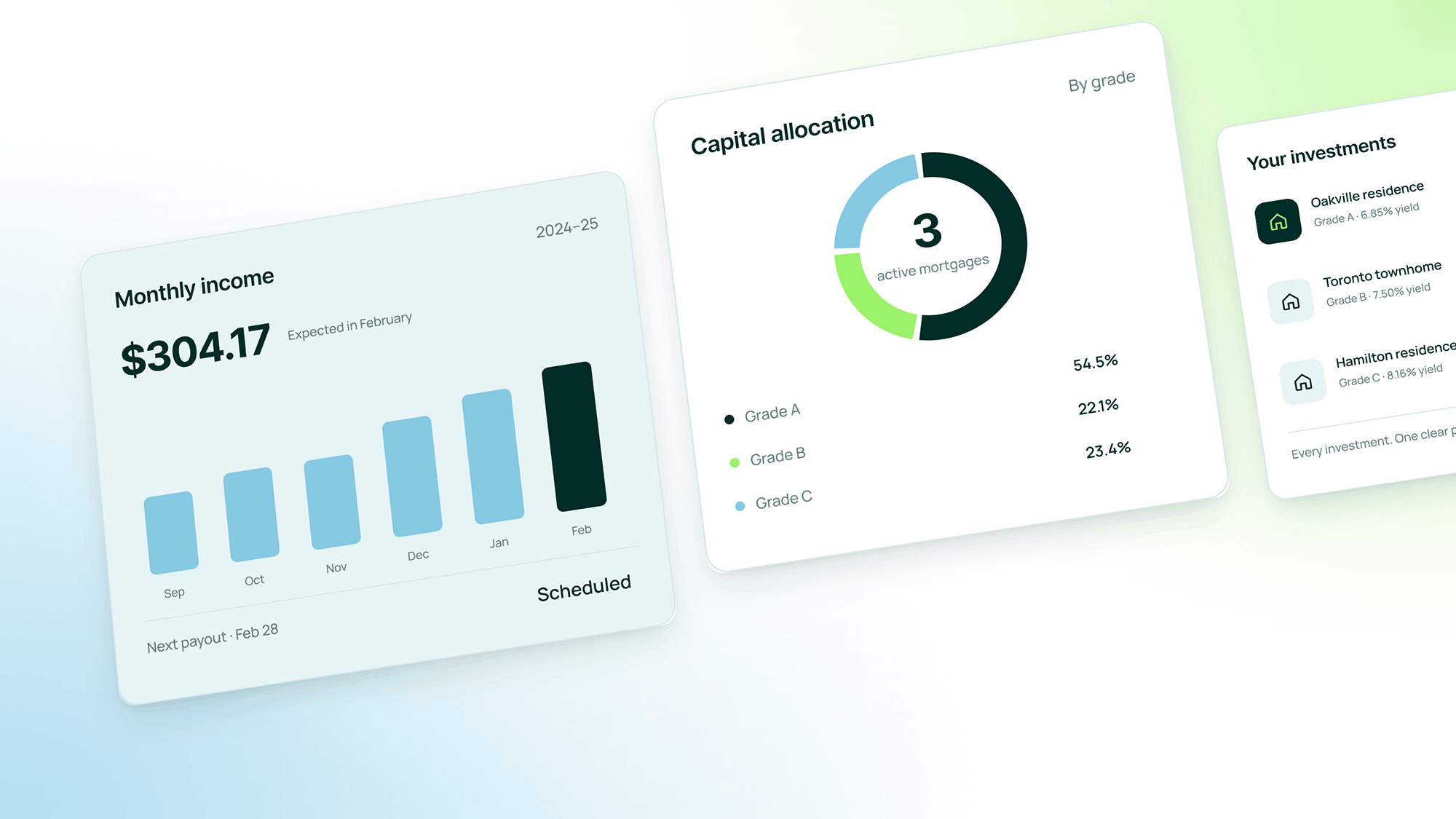
Loanova has two sides to every loan. Borrowers want to know how close they are to owning their home. Investors want to know what their money did this month. Each workspace opens on that answer, big and plain, before a single table. The identity carries straight into the product.