Gebaut(06)
Overview
Gebaut Projects is a bold Australian venture grounded in smart, sustainable building systems. With a name derived from the German word for “built,” the brand carries a dual meaning that reflects both its European precision and local expertise. The focus is on high-quality, systemized construction that’s both commercial and residential, and custom-tailored for clients who value thoughtful design, strong outcomes, and efficiency without compromise.
Approach
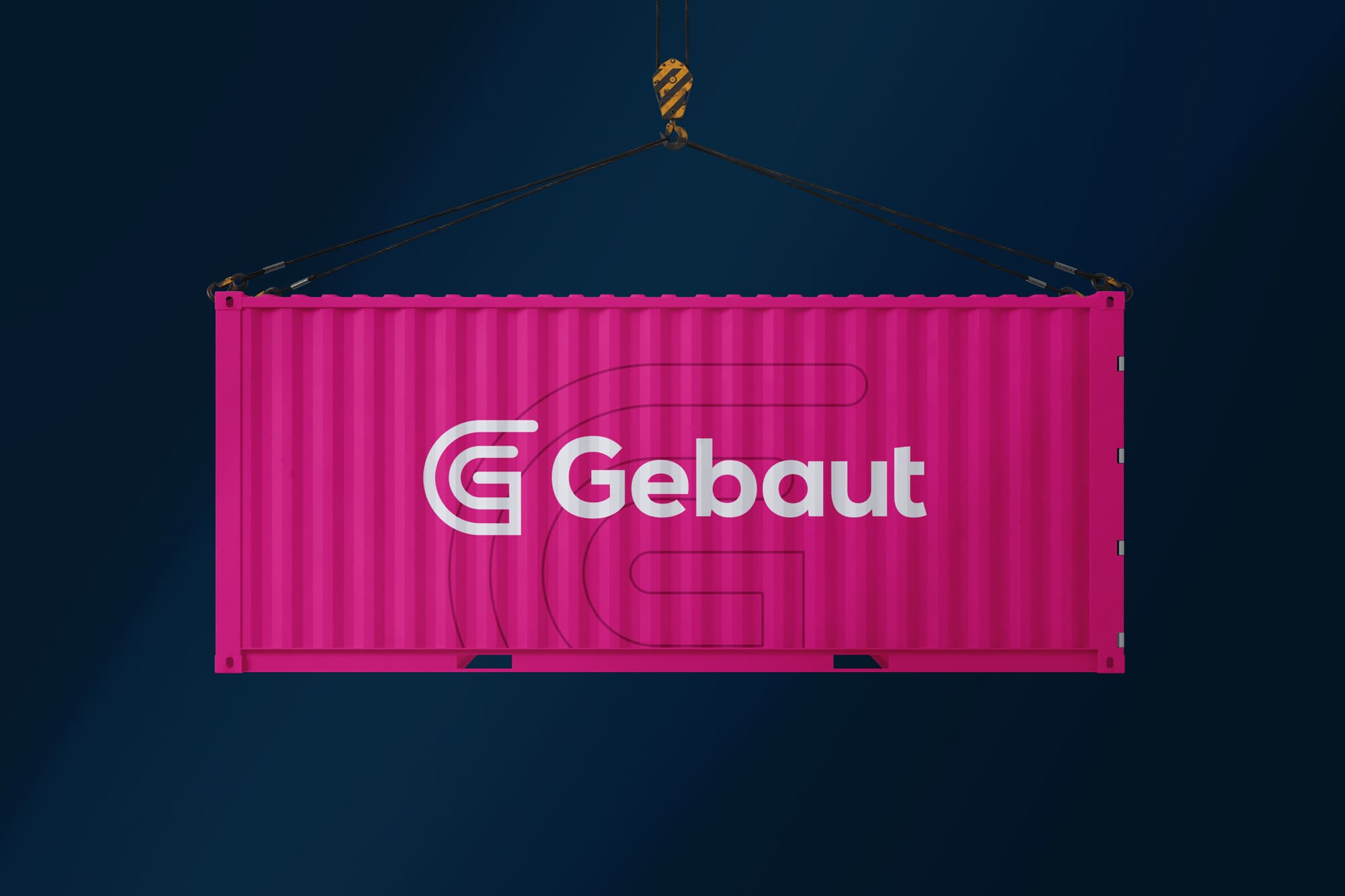
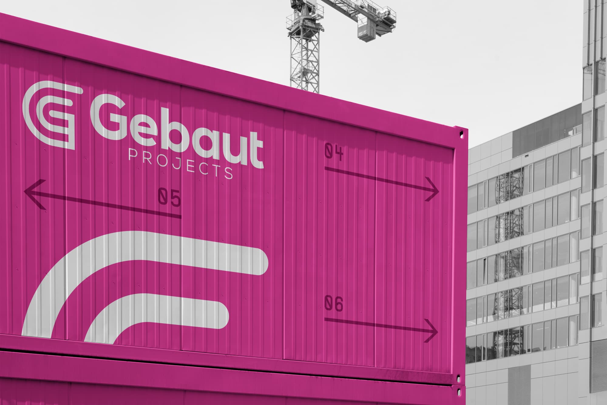
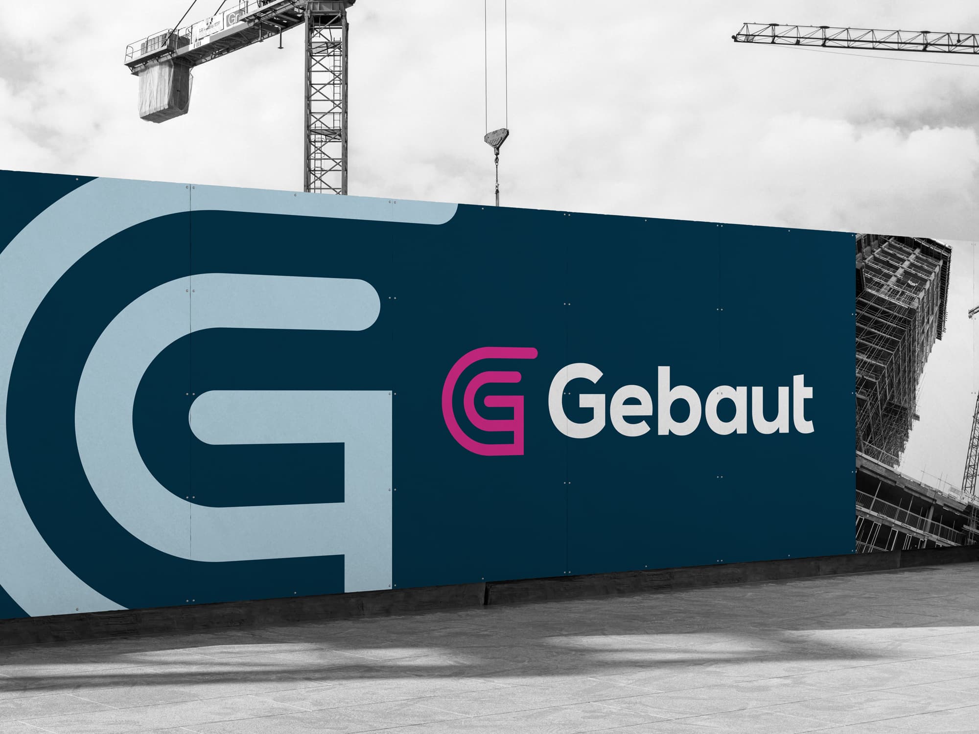
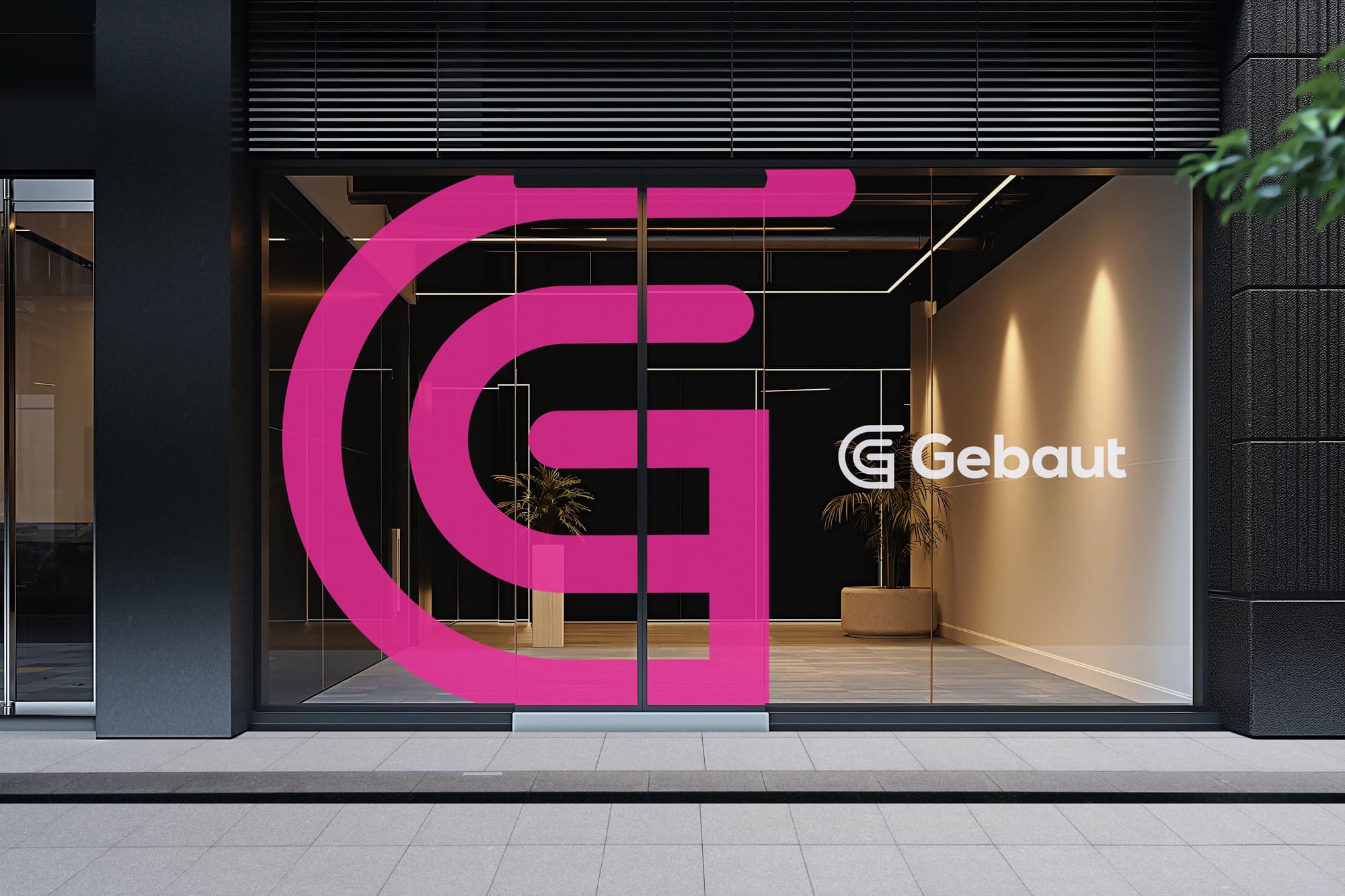
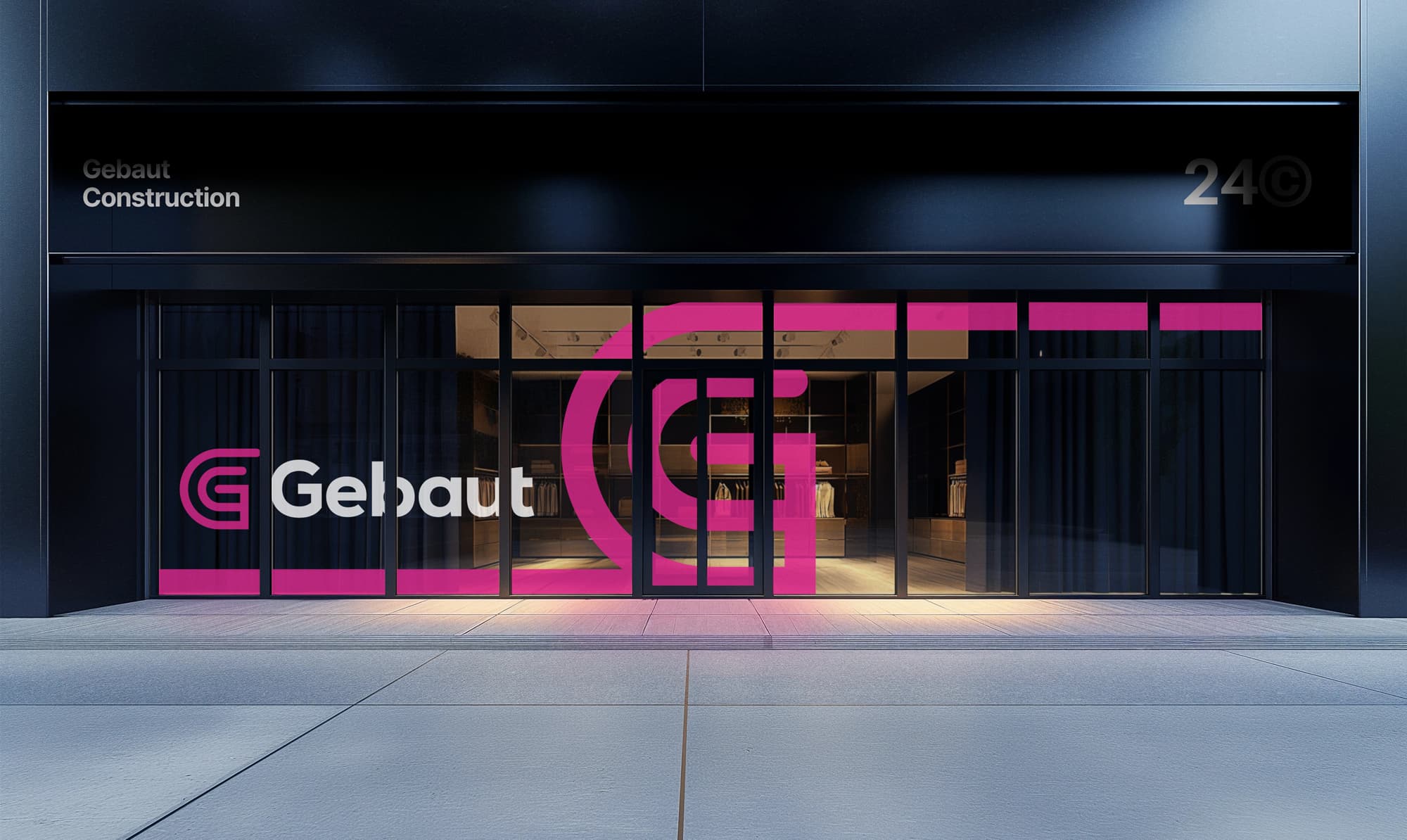
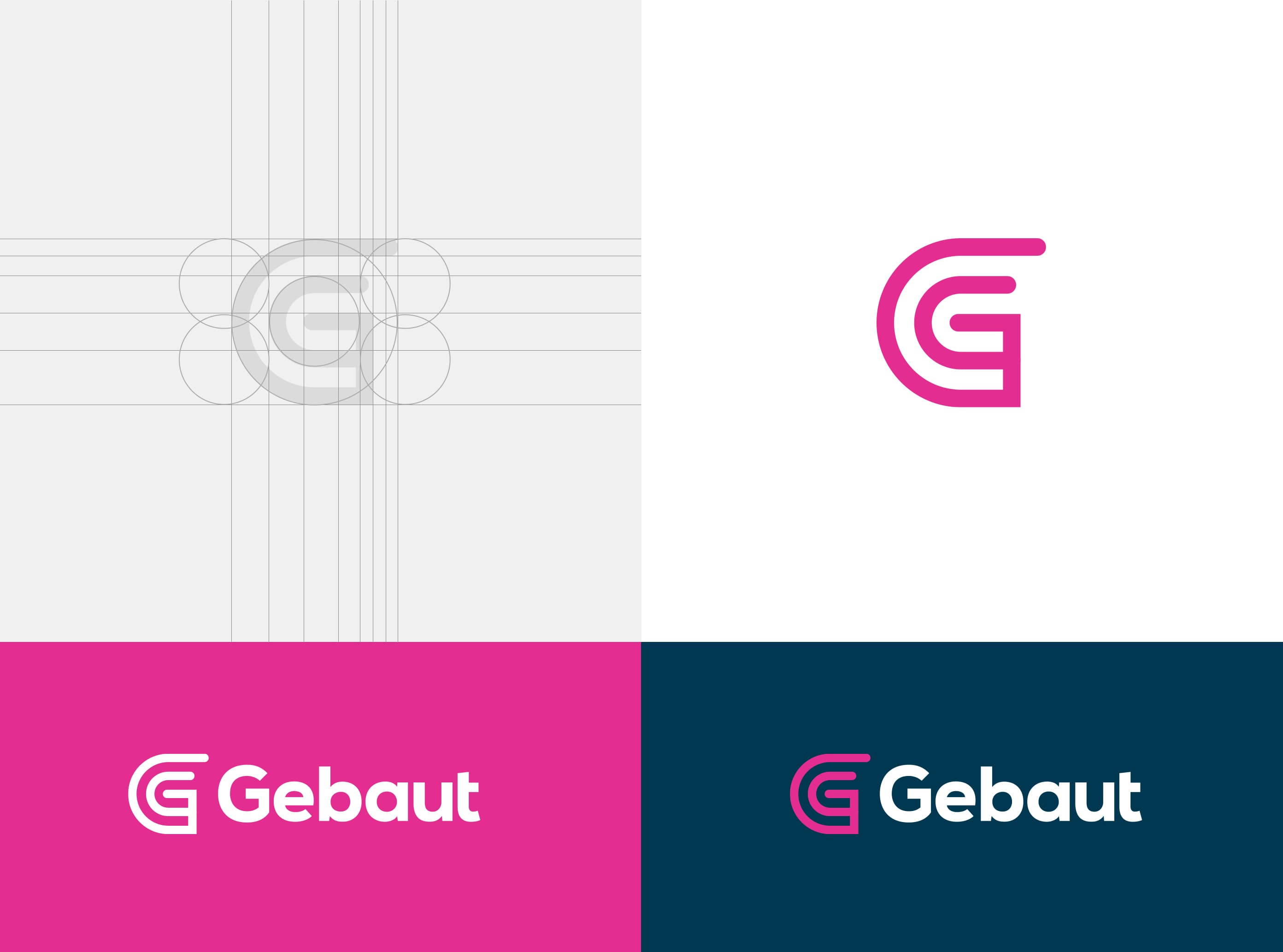
The goal was to create a logo that embodies structure, clarity, and purpose. Without relying on any clichés, or even a green color palette. It needed to feel architectural but not cold, modern but not trendy. Creative. And most importantly, it had to work as a symbol of trust and craft: something that could stand alone on site hoardings, business cards, or a website footer, and still feel instantly recognizable and rooted in the brand’s identity. It needed to be loud without screaming.
Outcome
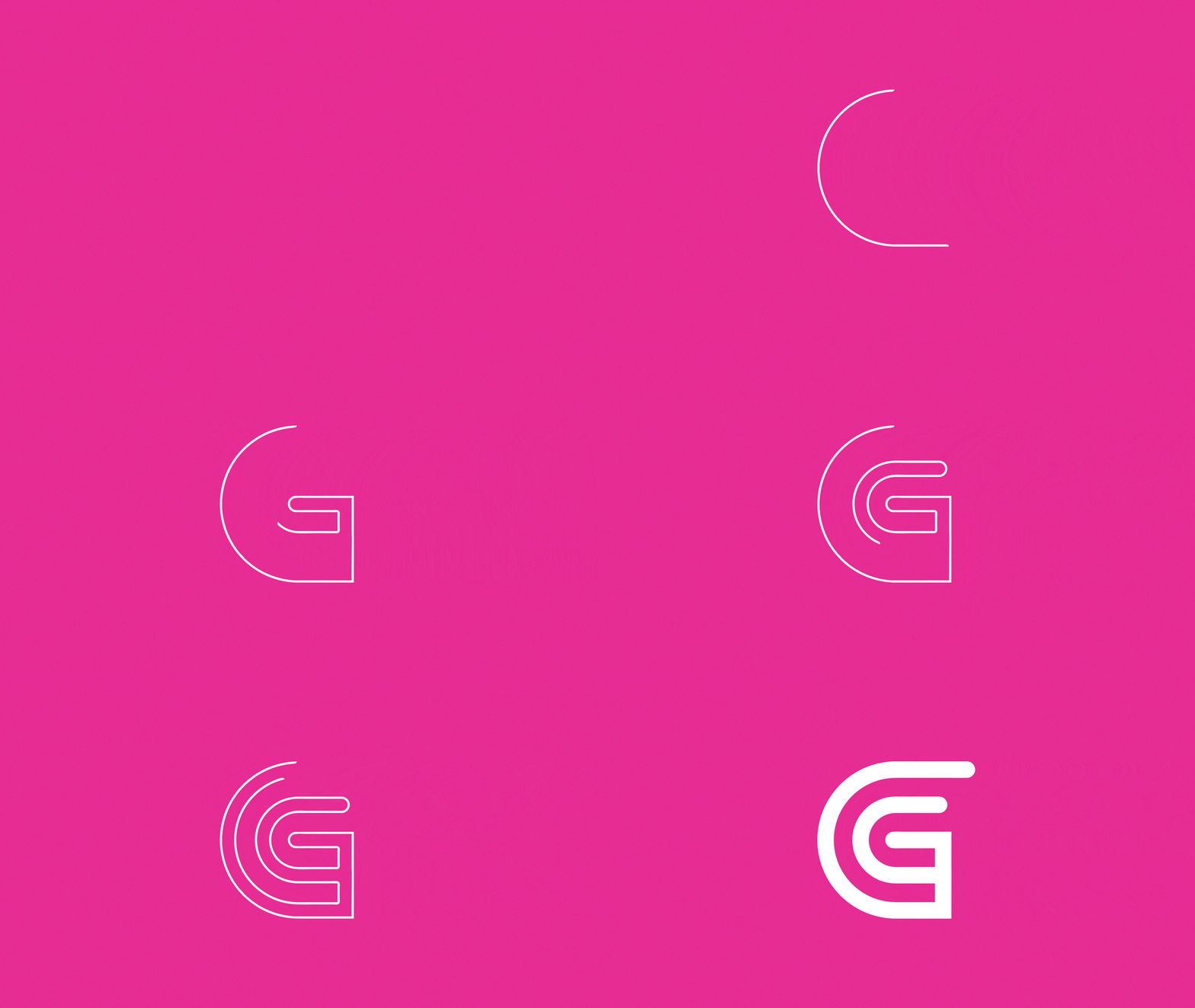
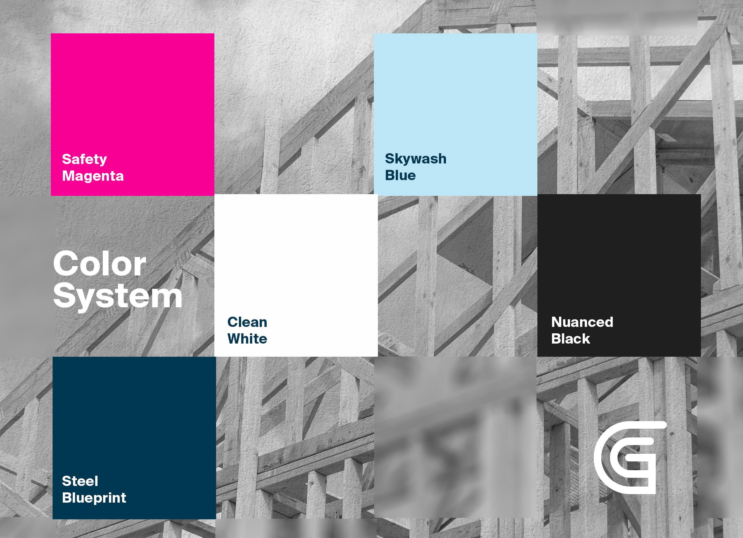
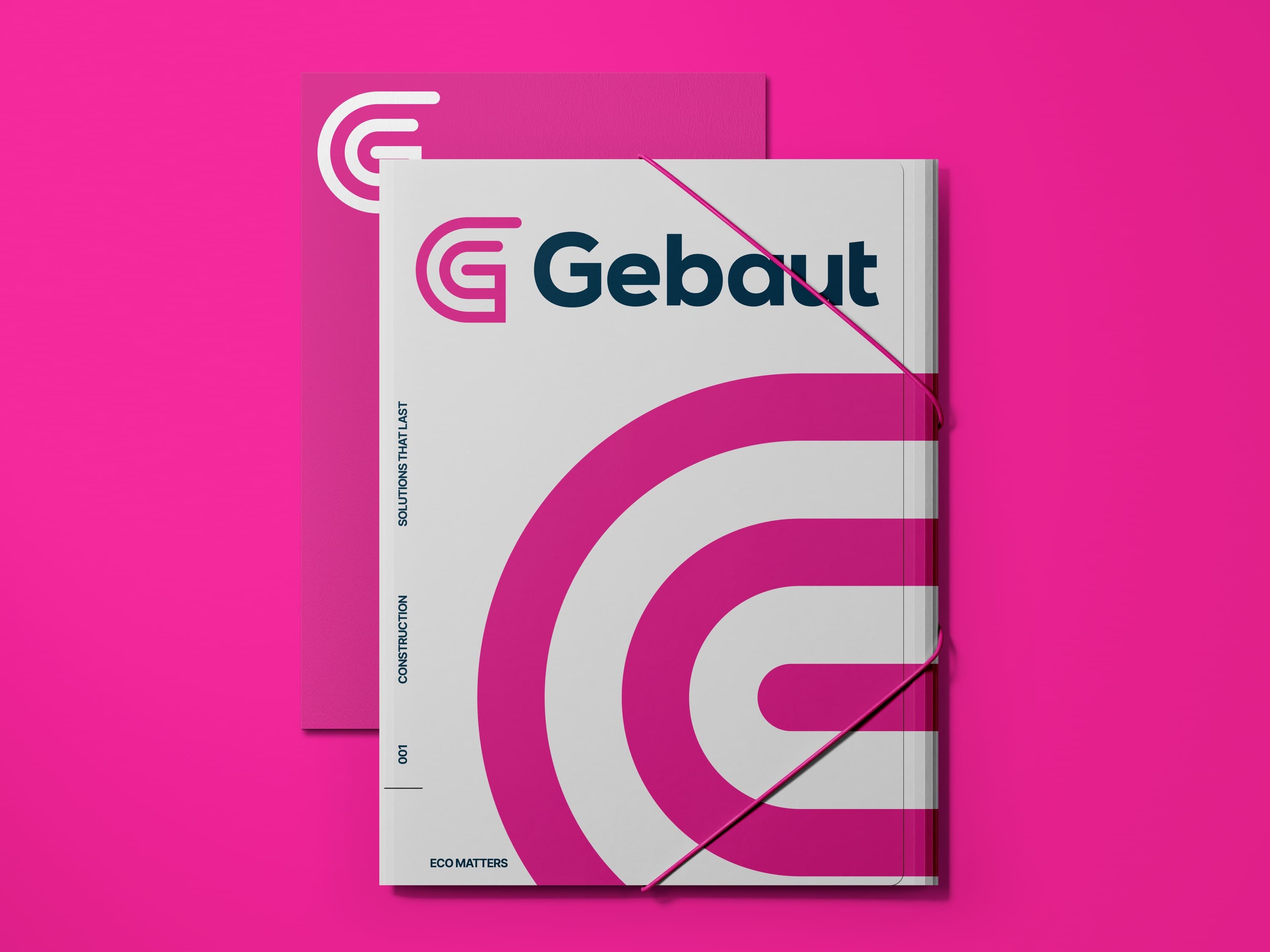
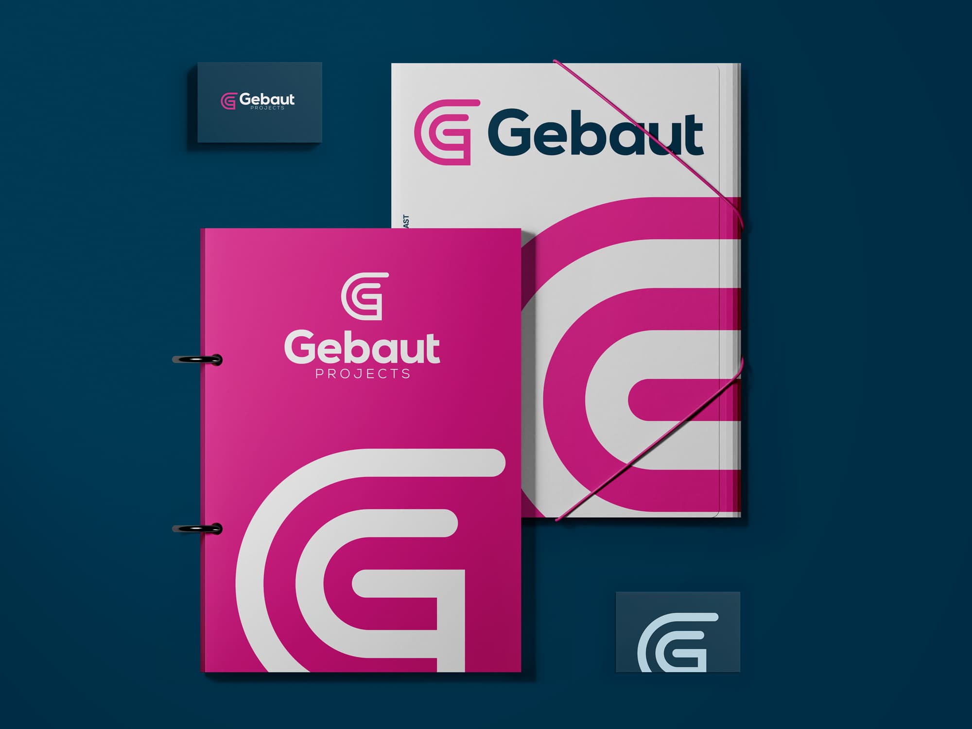
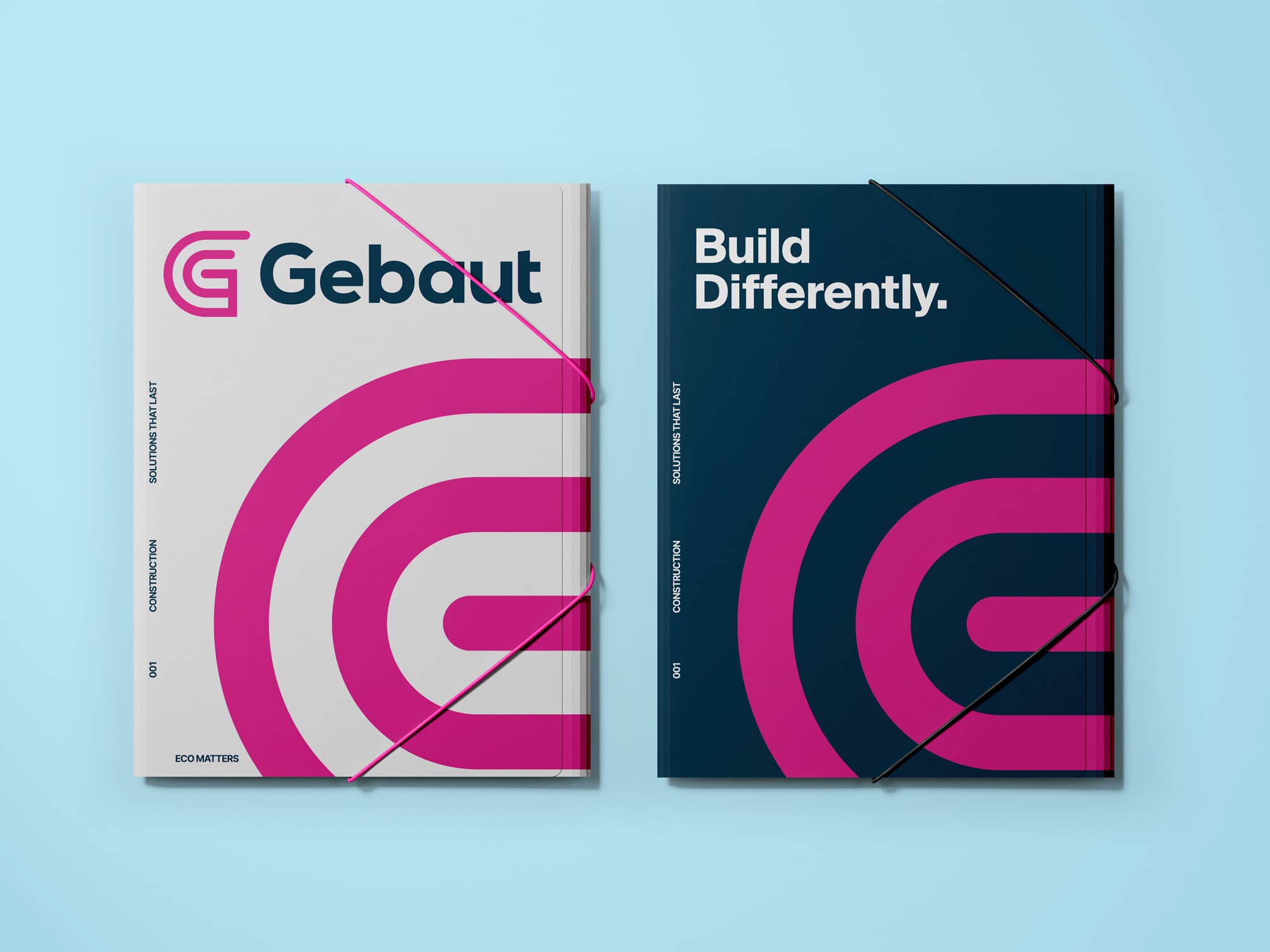
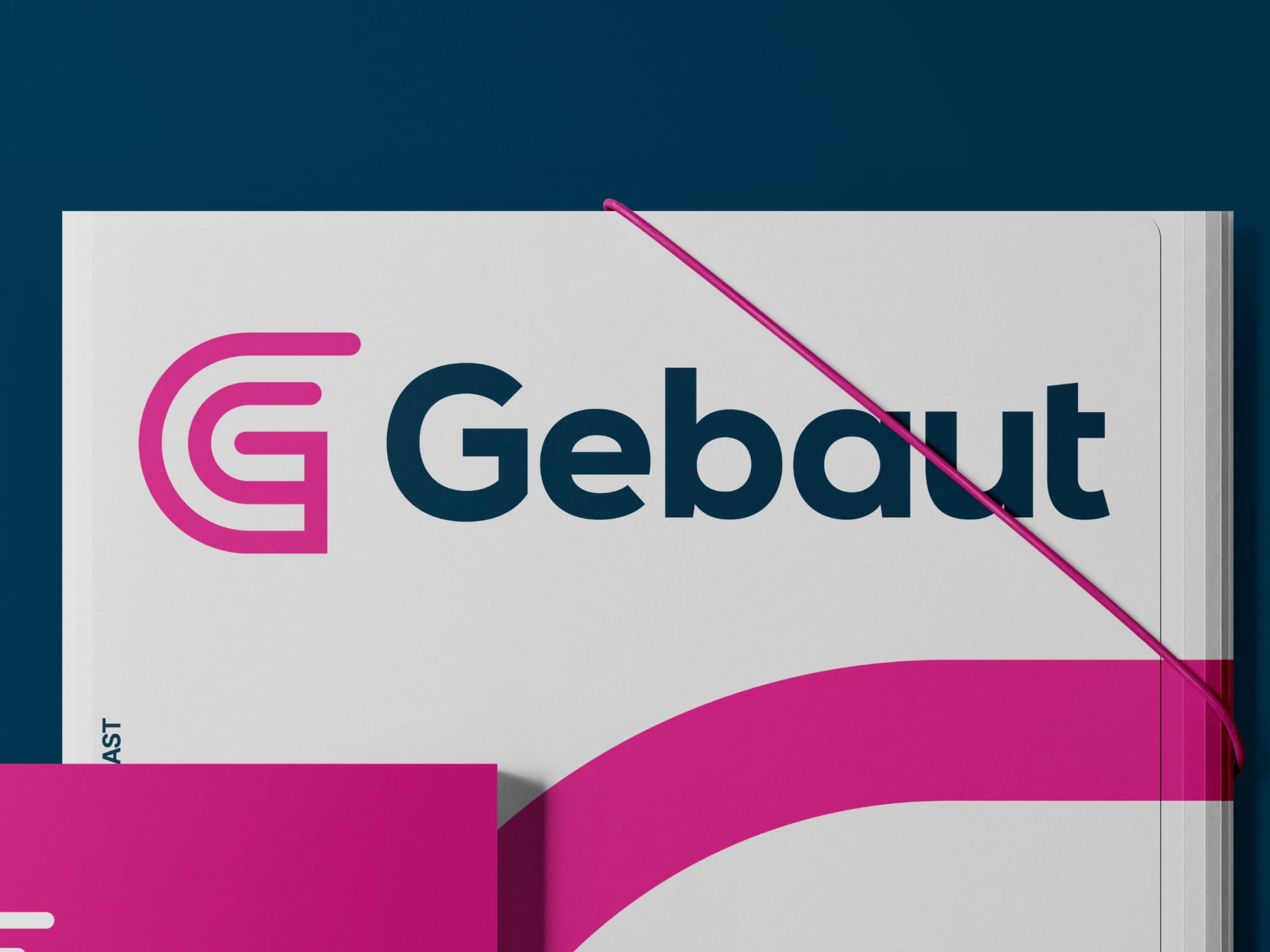
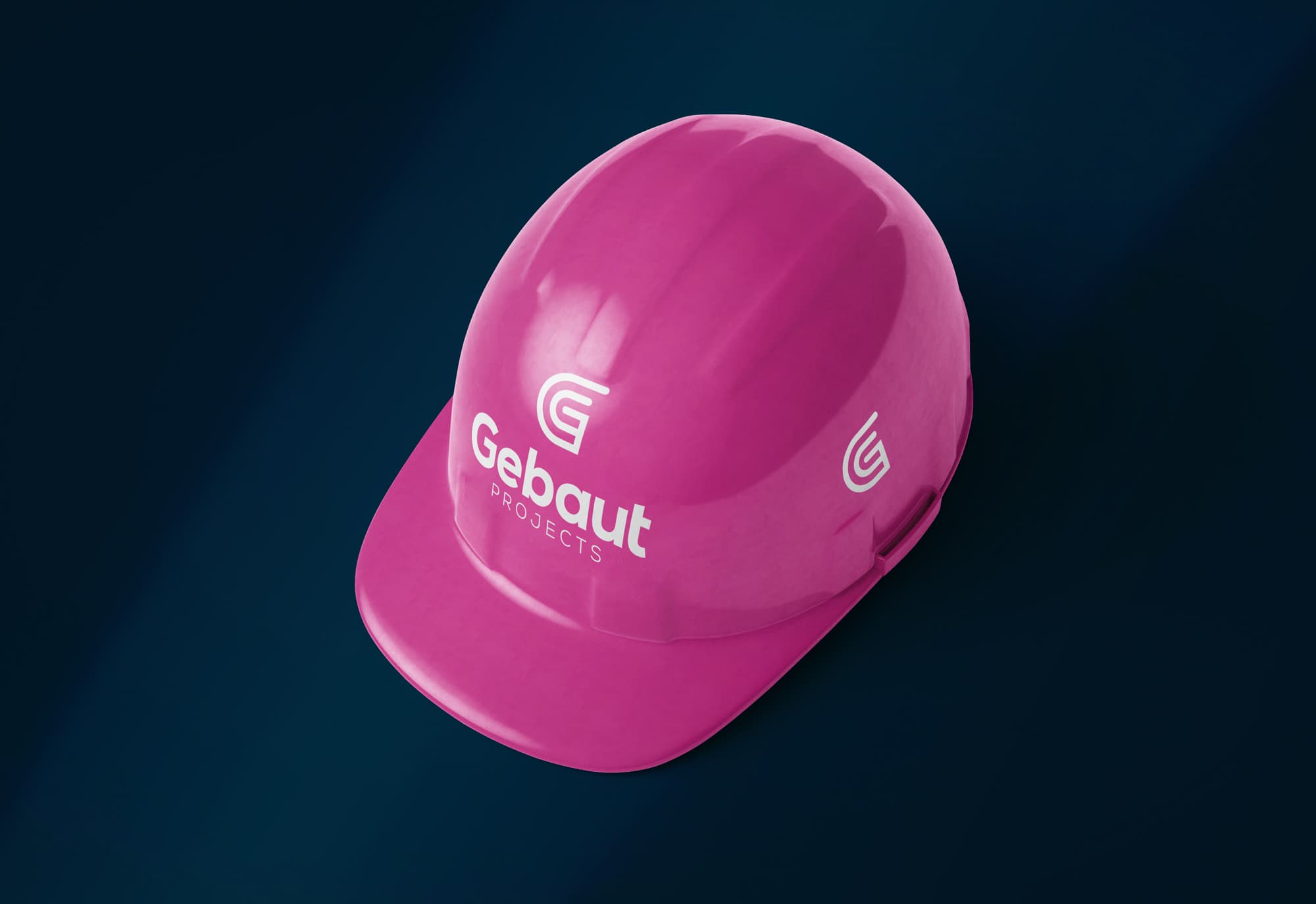
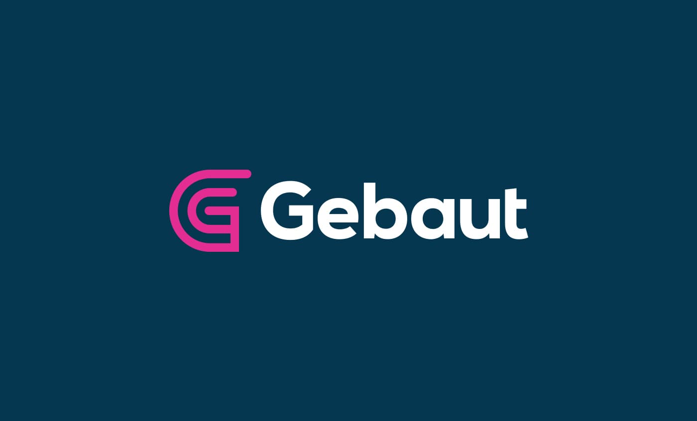
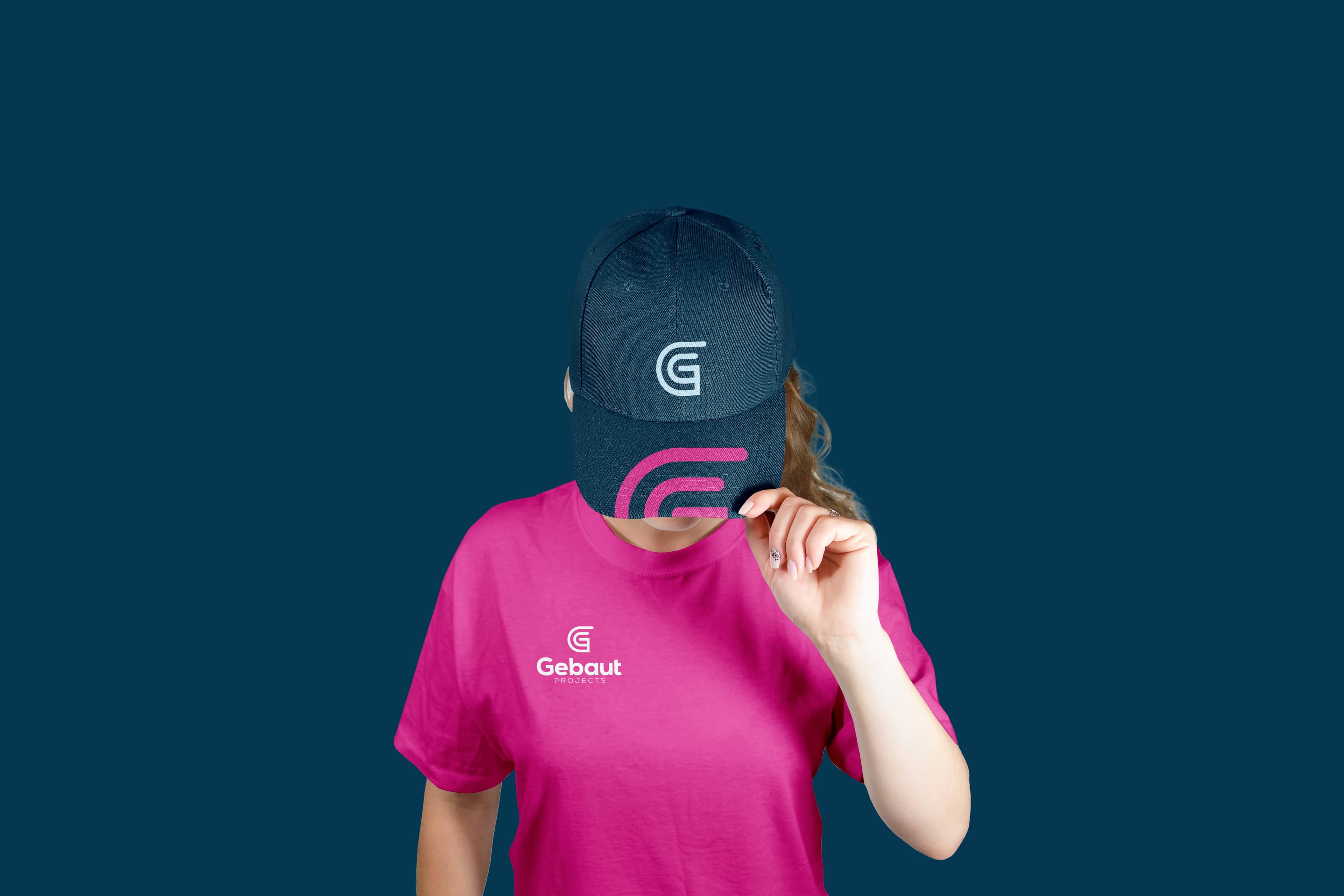
I designed a clean, geometric mark that subtly echoes construction logic, built up from a single line that reflects the idea of systems working in harmony. It’s abstract enough to feel timeless, but deliberate in its composition, hinting at both the structure and ethos of Gebaut. Paired with understated typography and a bold, confident color palette, the result is a flexible identity that feels engineered, not just designed.