Cohort(07)

Overview
Cohort is a New York collective for independent filmmakers, actors, writers, and anyone with a story and no crew. The format is the whole point. You walk in, get placed with a small team of strangers, spin a wheel for your genre, and have two weeks to write, shoot, and cut a short film. Then every film plays back to back in one room, in front of everyone. They asked me for an identity that feels like that room. Open, a little loud, and never about one person.
Approach
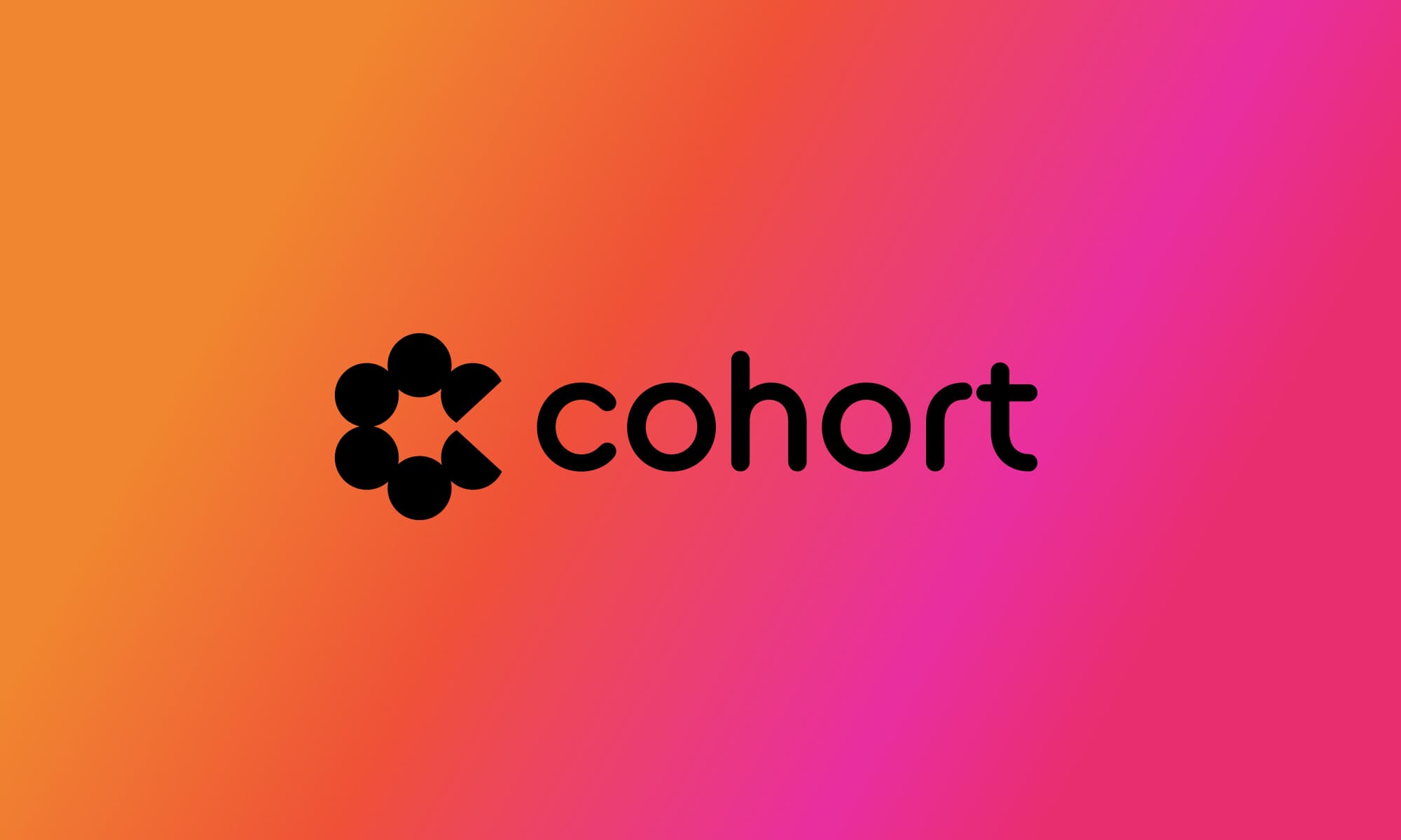
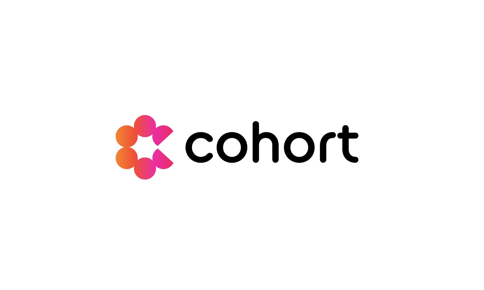
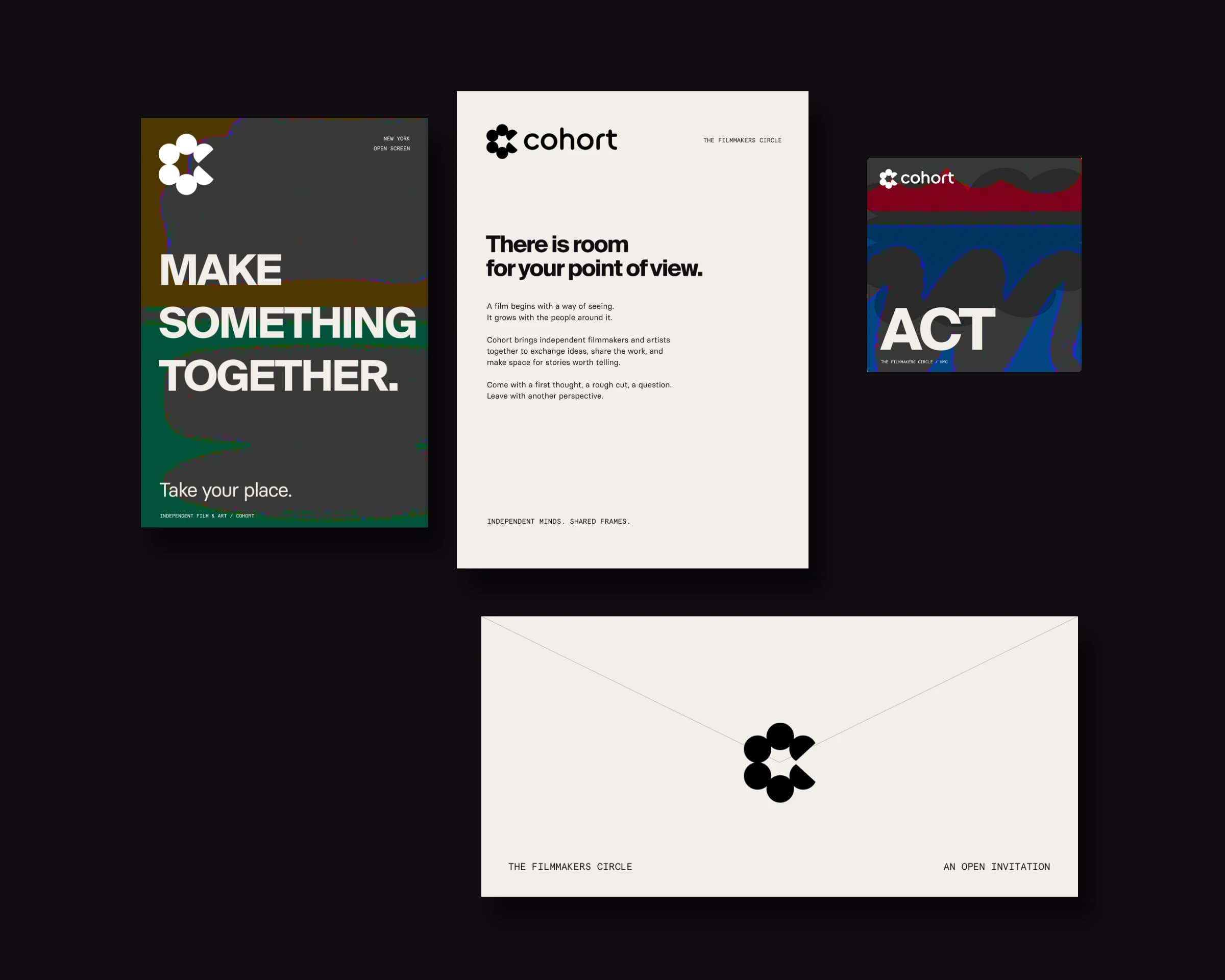
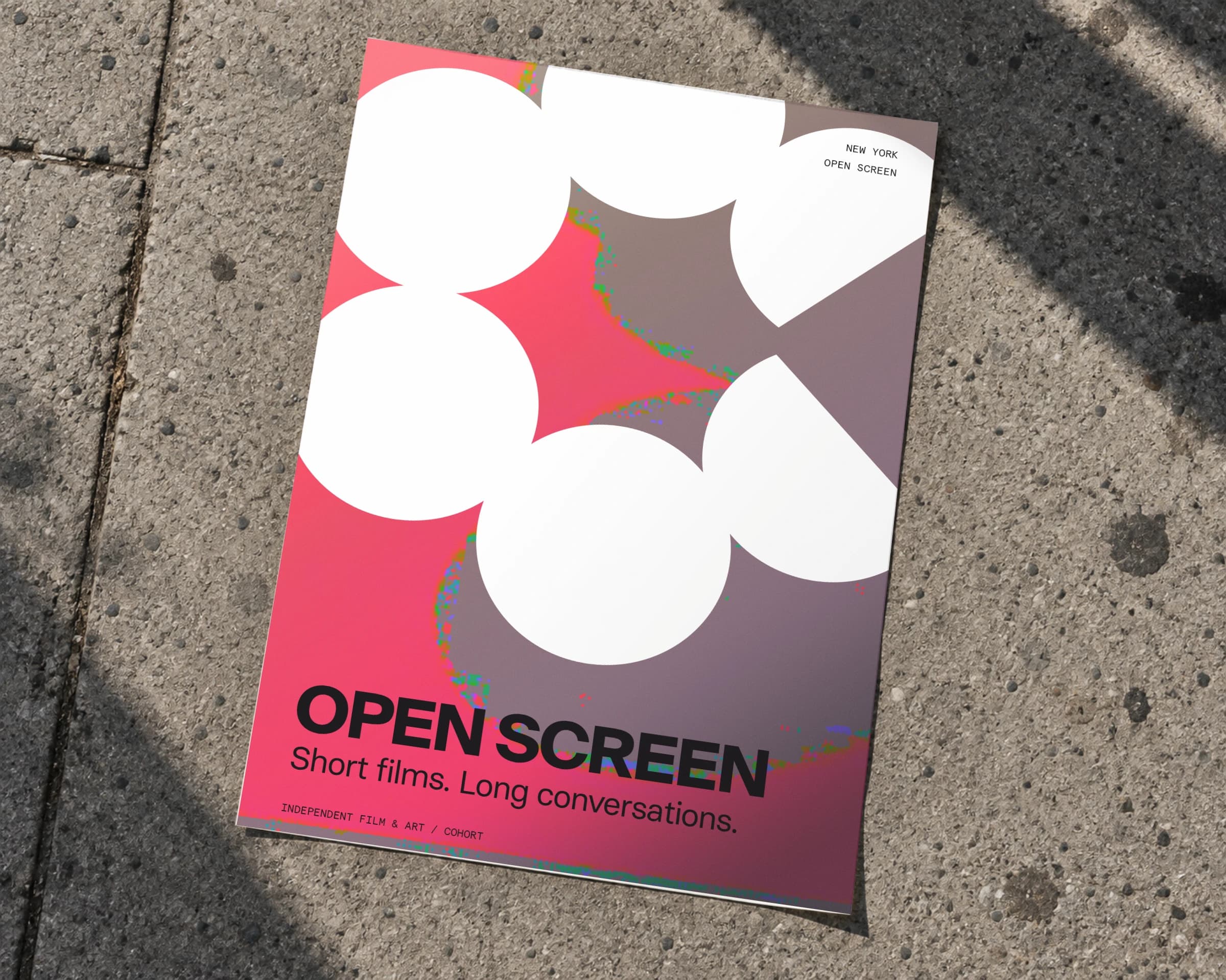
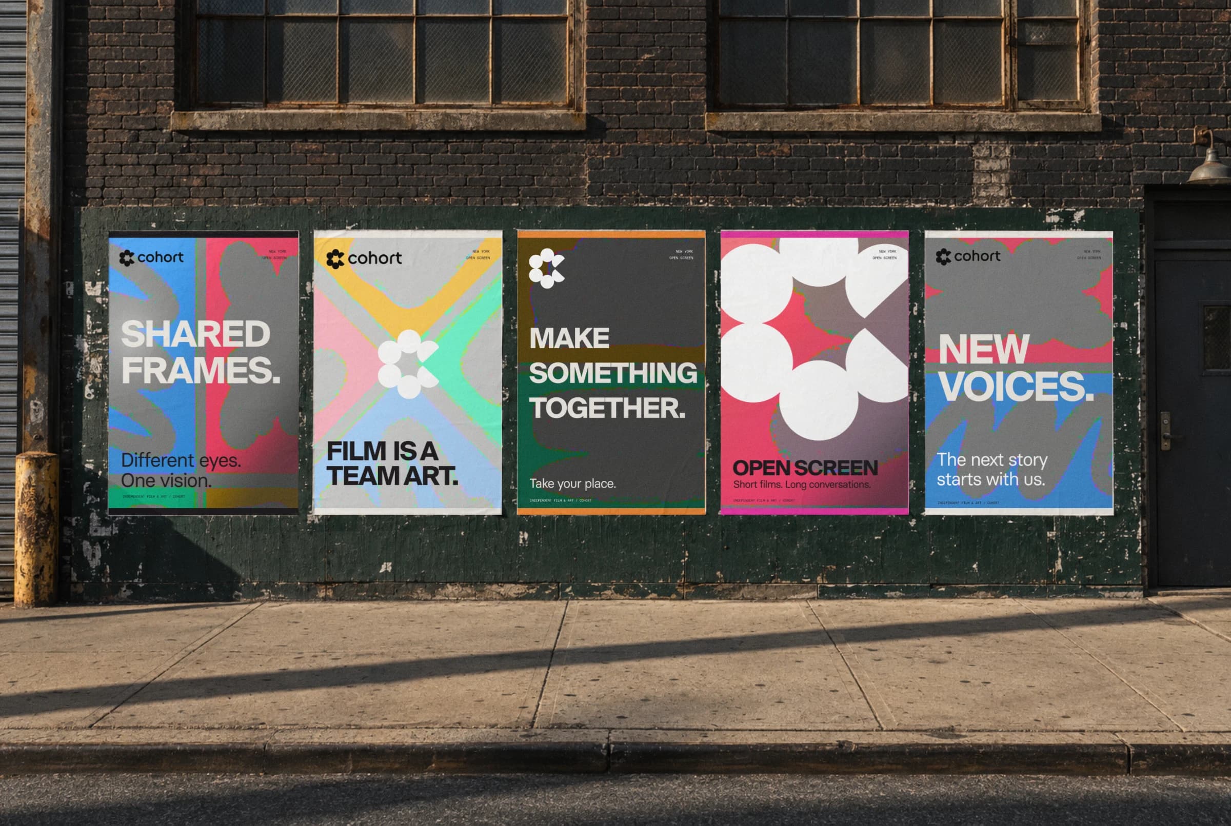
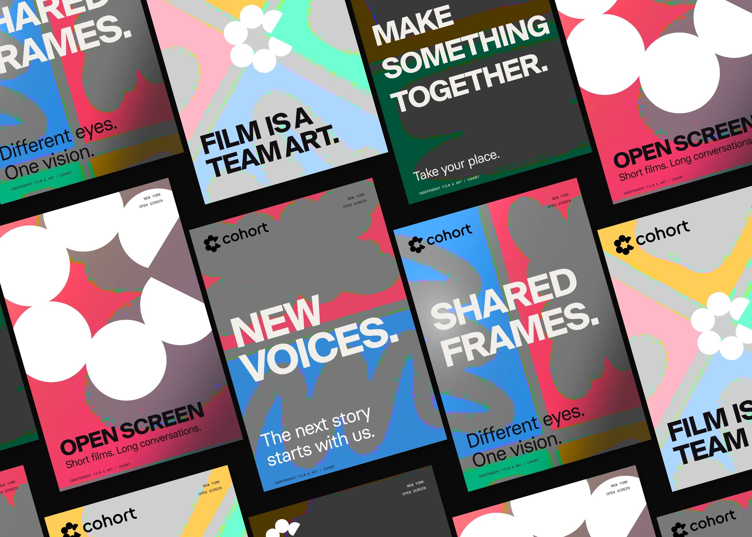
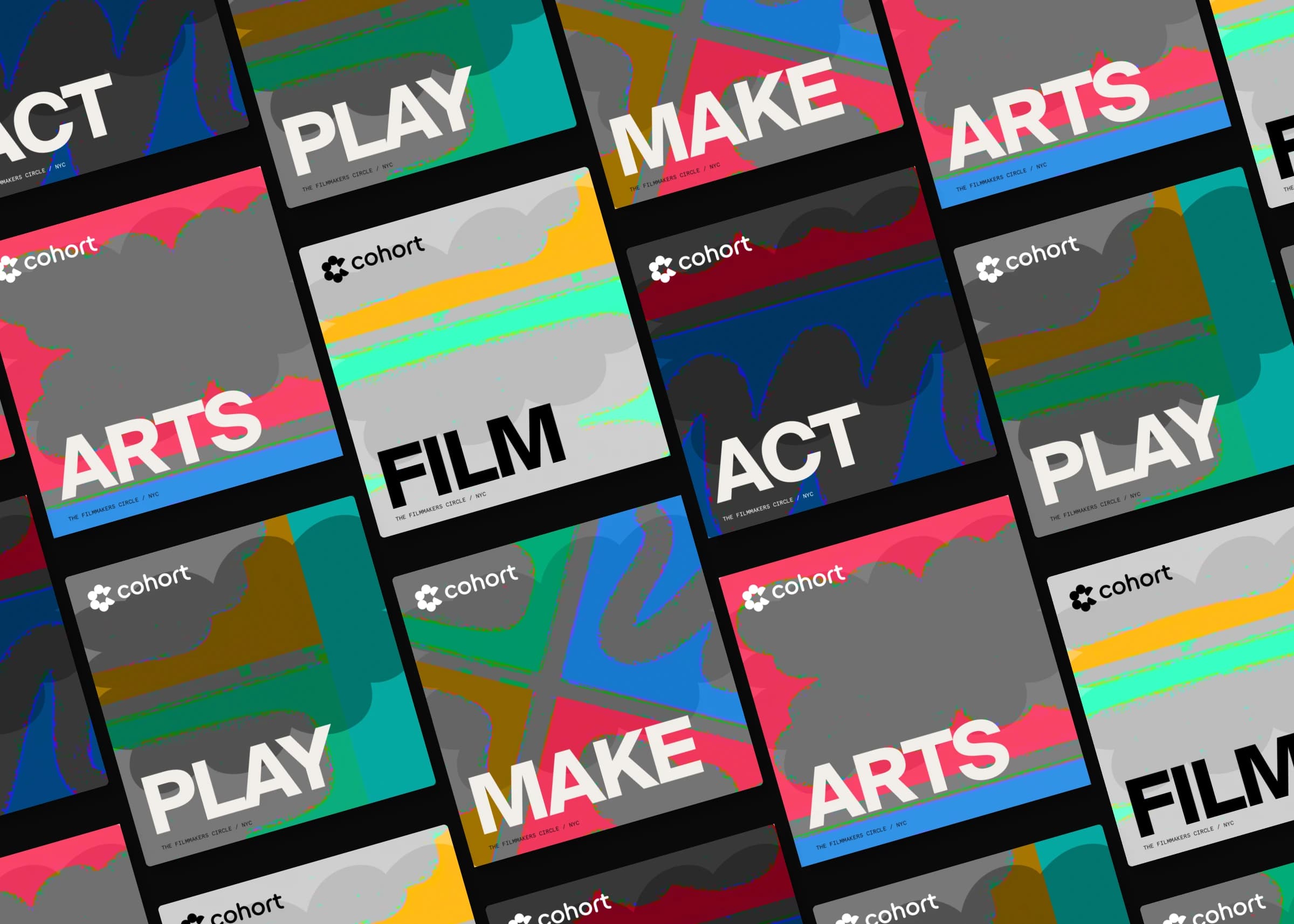
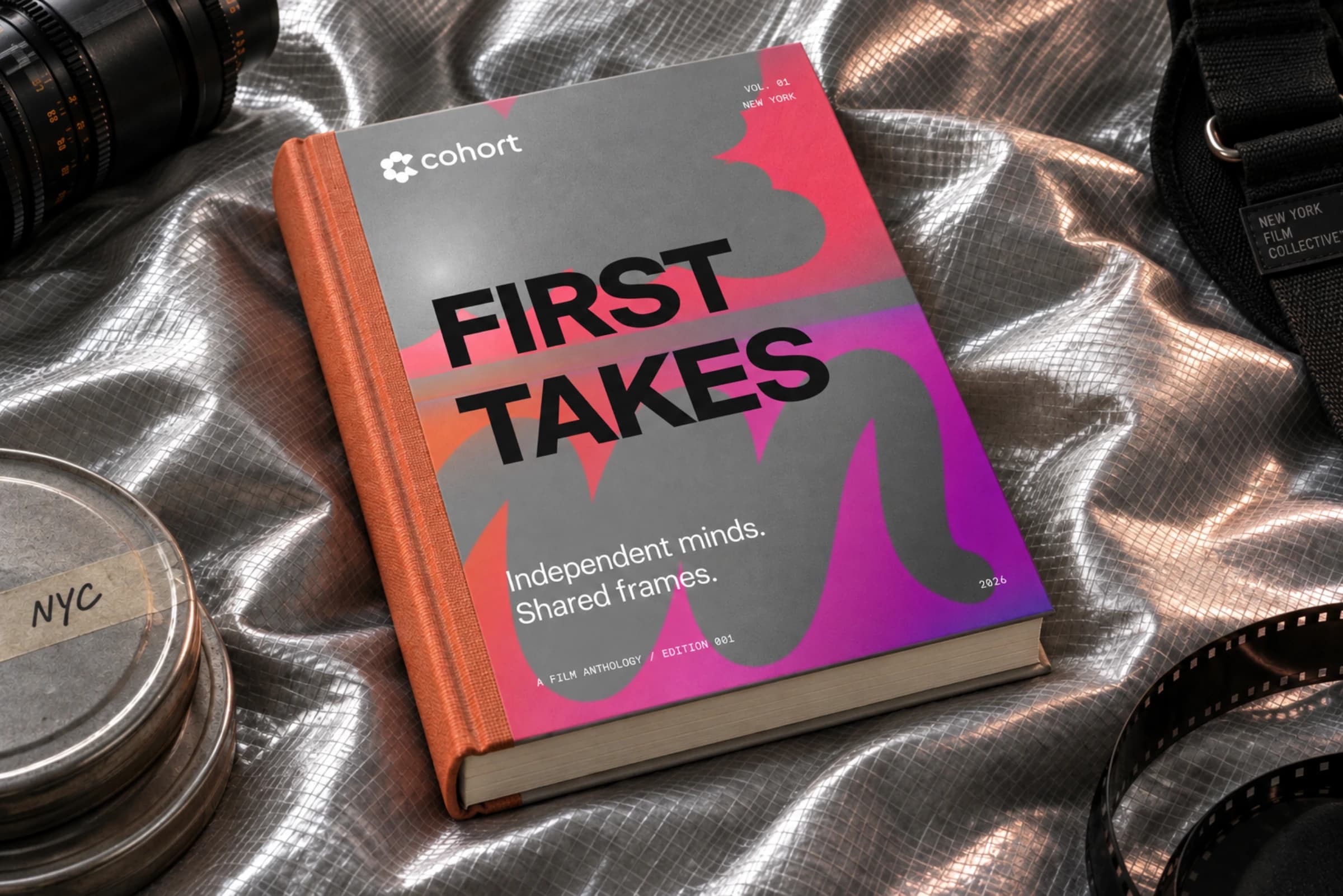
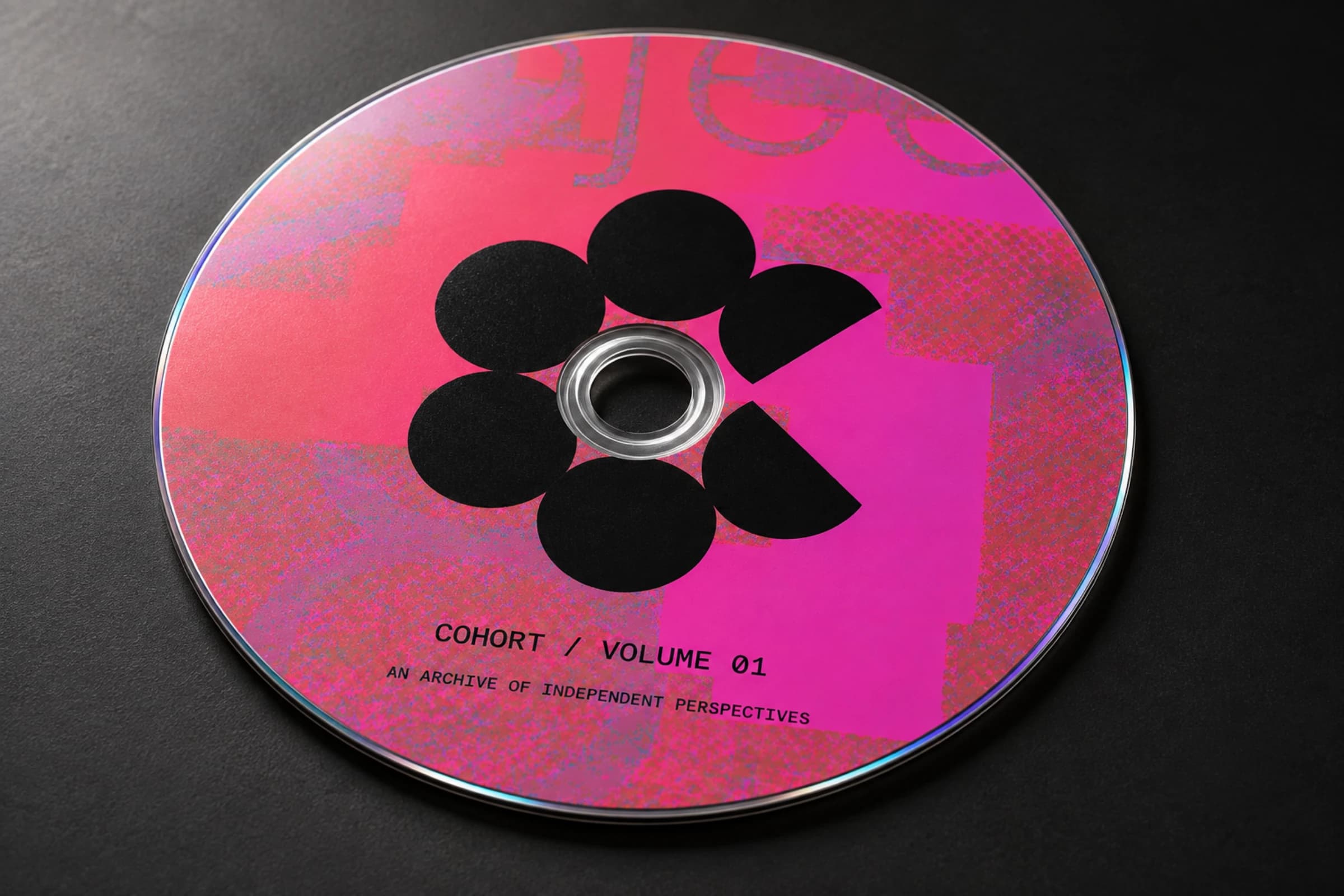
Everything grows out of one shape. Six forms stand in a ring, and two of them are cut away to make the C. Look at the middle. It opens to the right like the beam of a projector, light spreading out toward the screen. The crew in a circle, and the picture pouring out of it. That was the idea. I kept the rest of the system loose on purpose. A gradient that burns from orange to magenta. Soft gray shapes drifting over loud color, their edges breaking into pixels. Big headlines, a few words each. Mono type for the small print, like the notes on a slate.
Outcome
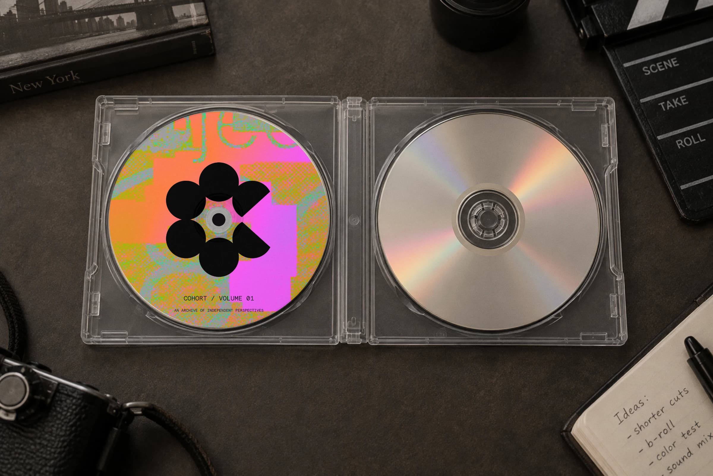
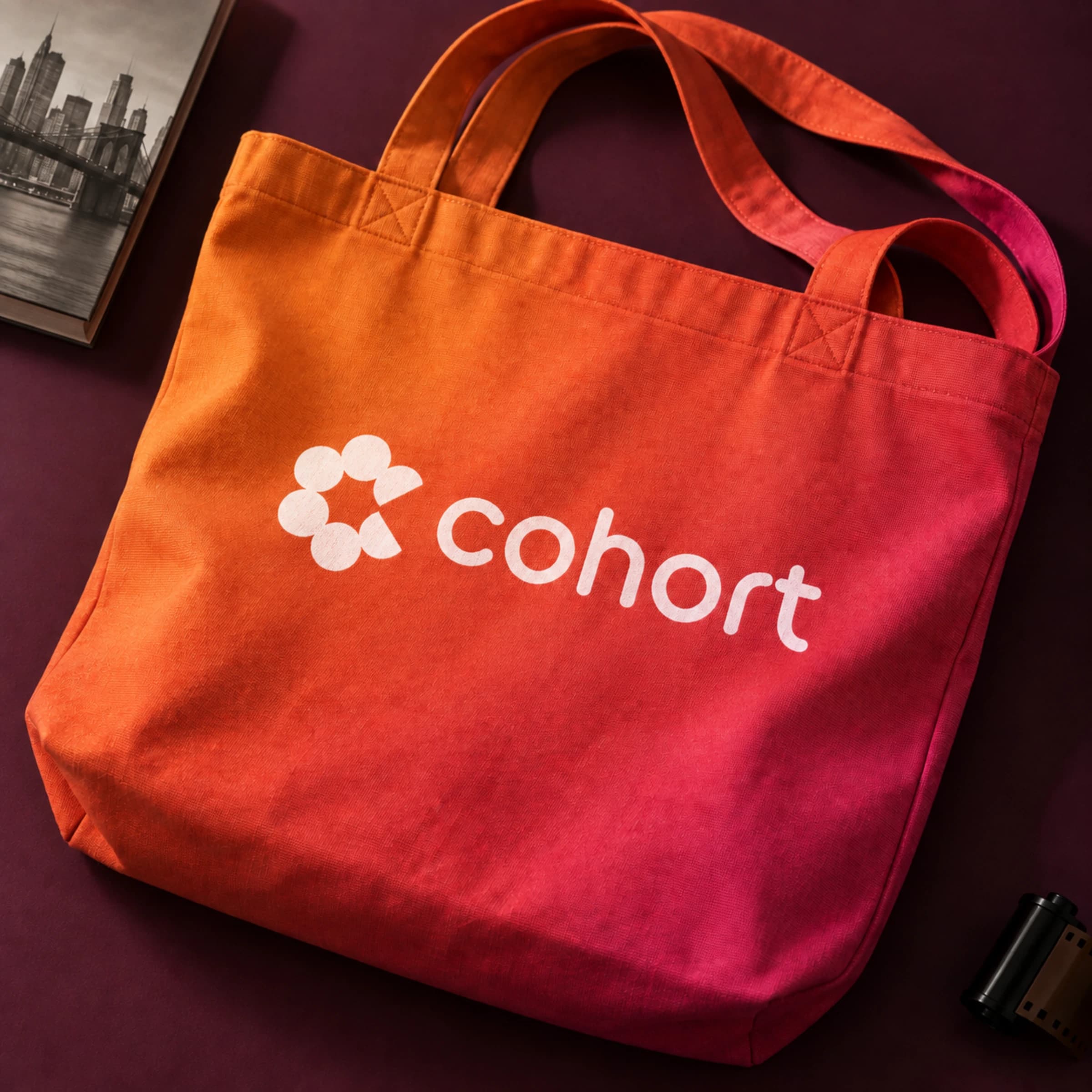
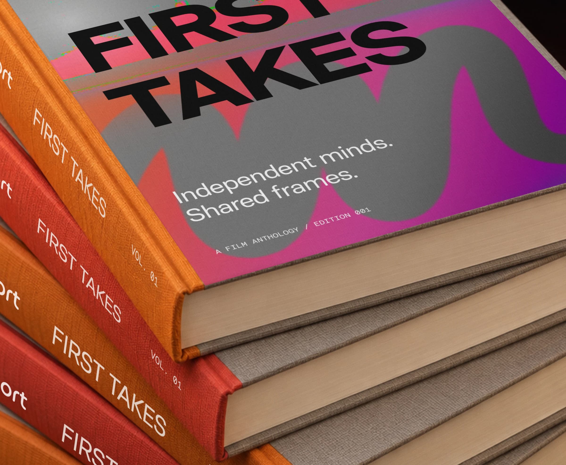
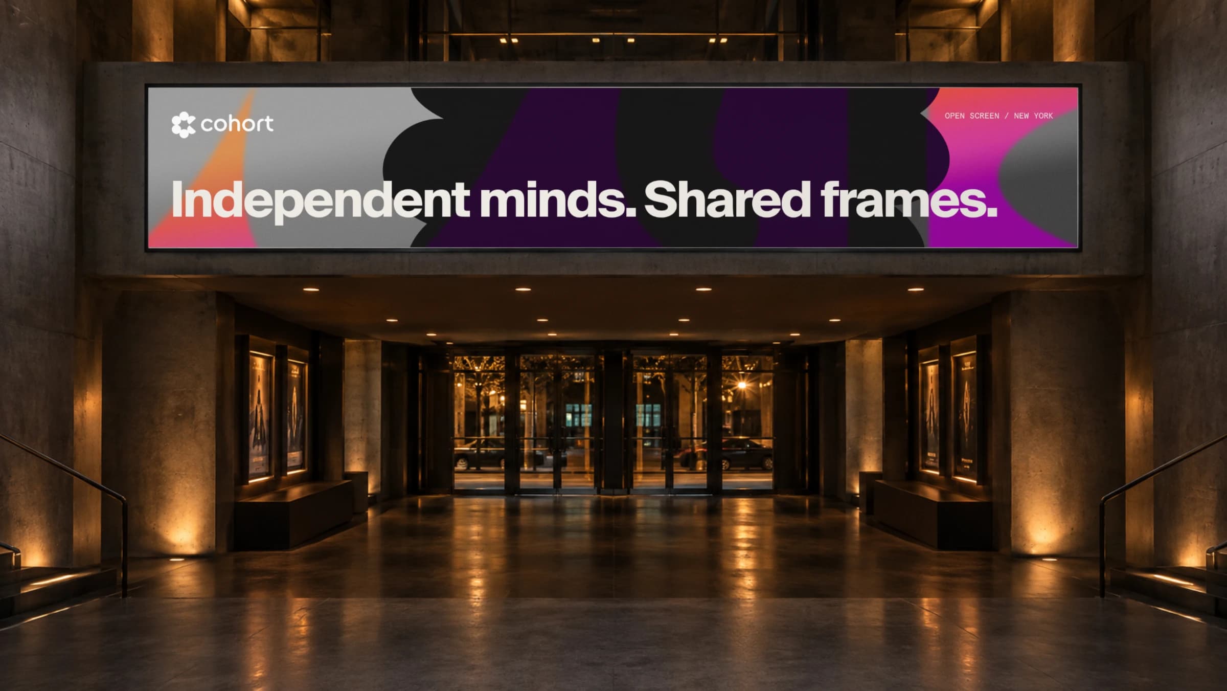
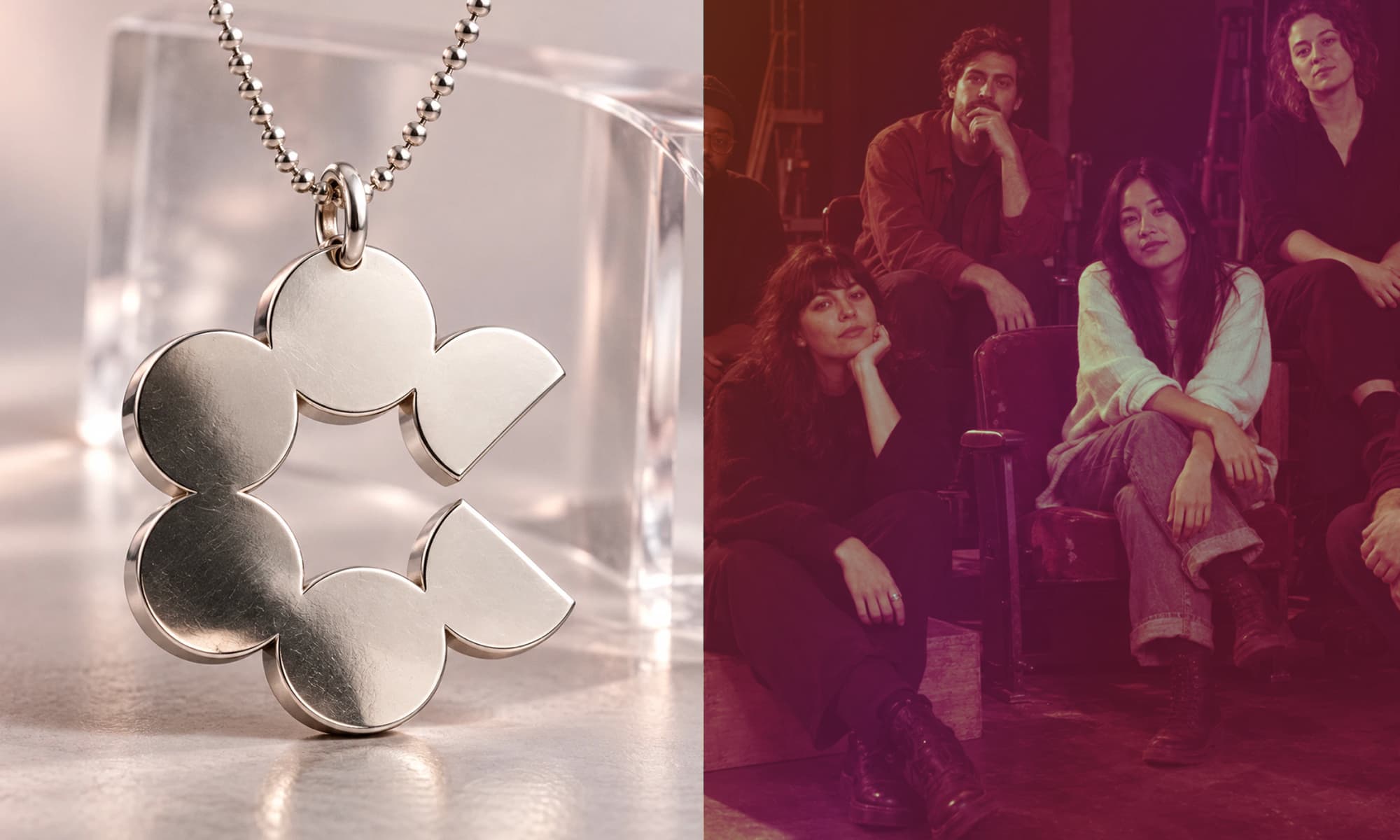
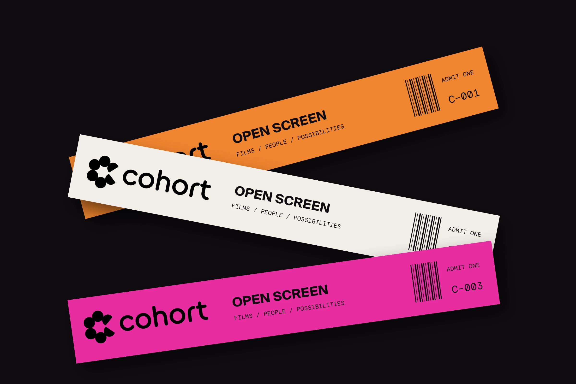
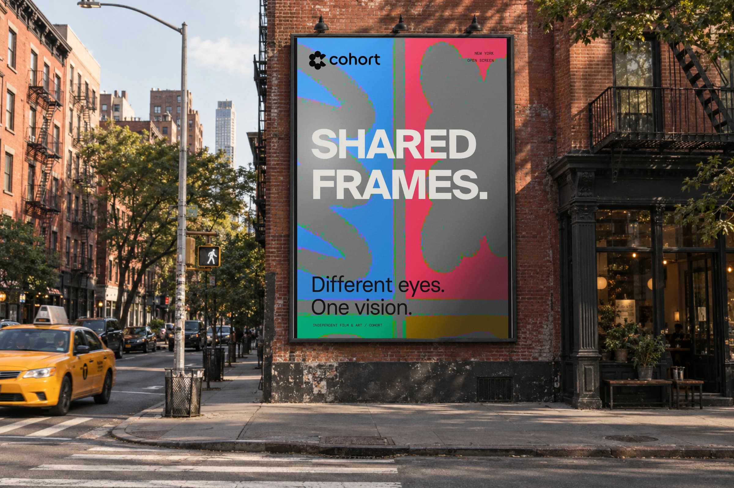
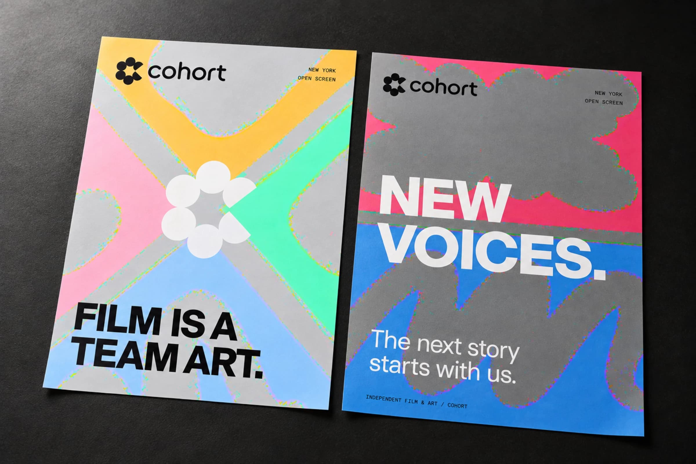
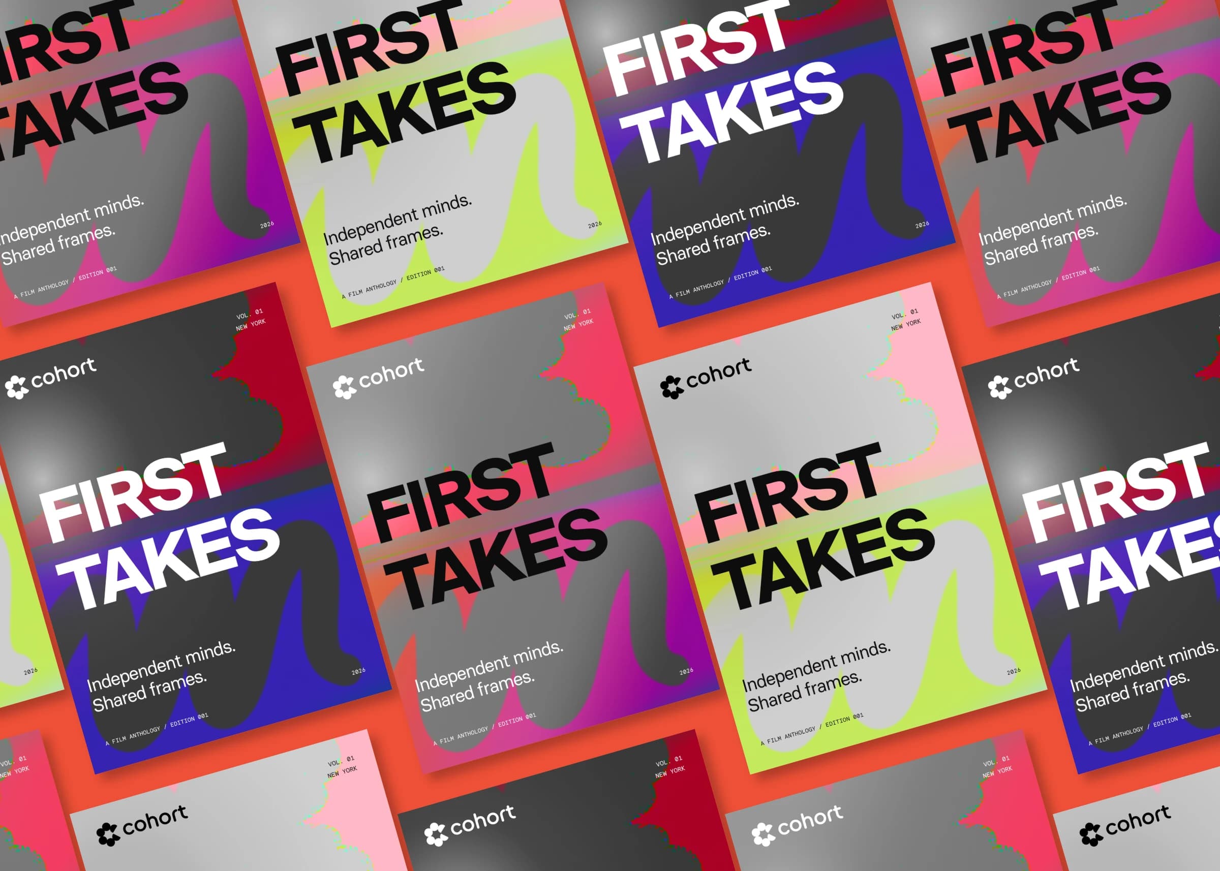
Cohort came away with a brand that sounds like its members. The posters do the talking. Film is a team art. Make something together. New voices. The same voice runs from a cinema lobby screen to a corner billboard to a wall of wheat-pasted prints. Then come the things people keep. A numbered ticket for Open Screen. A cloth-bound anthology called First Takes. Volume 01 on disc. A silver pendant of the mark. And a tote bag, orange melting into pink, on the L train home after the screening.