Bloomberg
Global media art direction
Overview
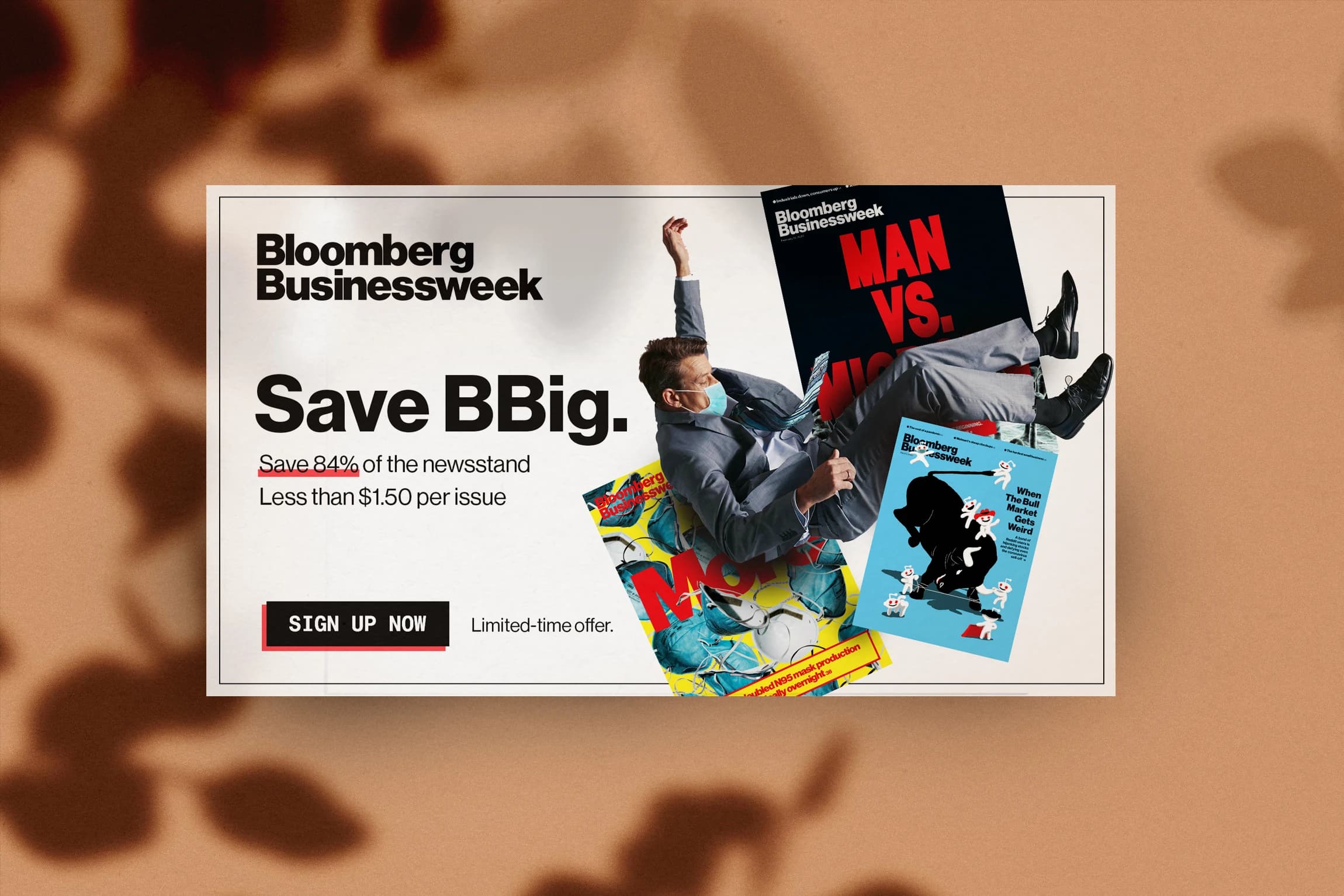
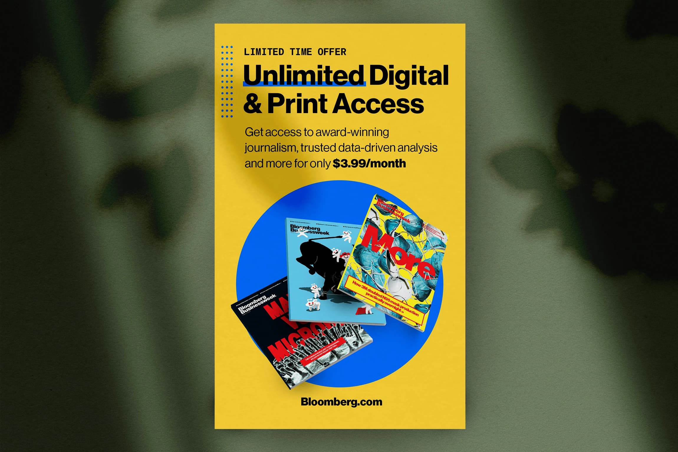
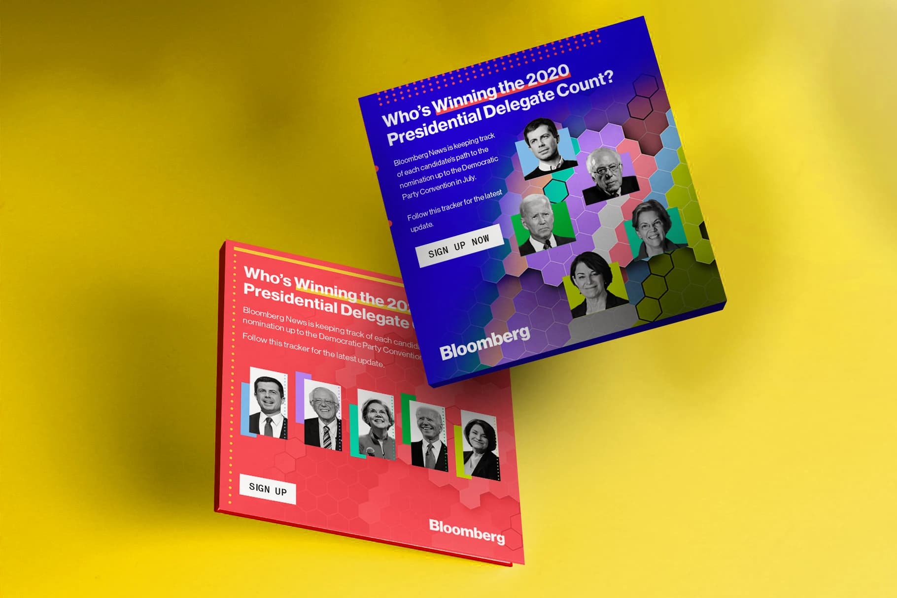
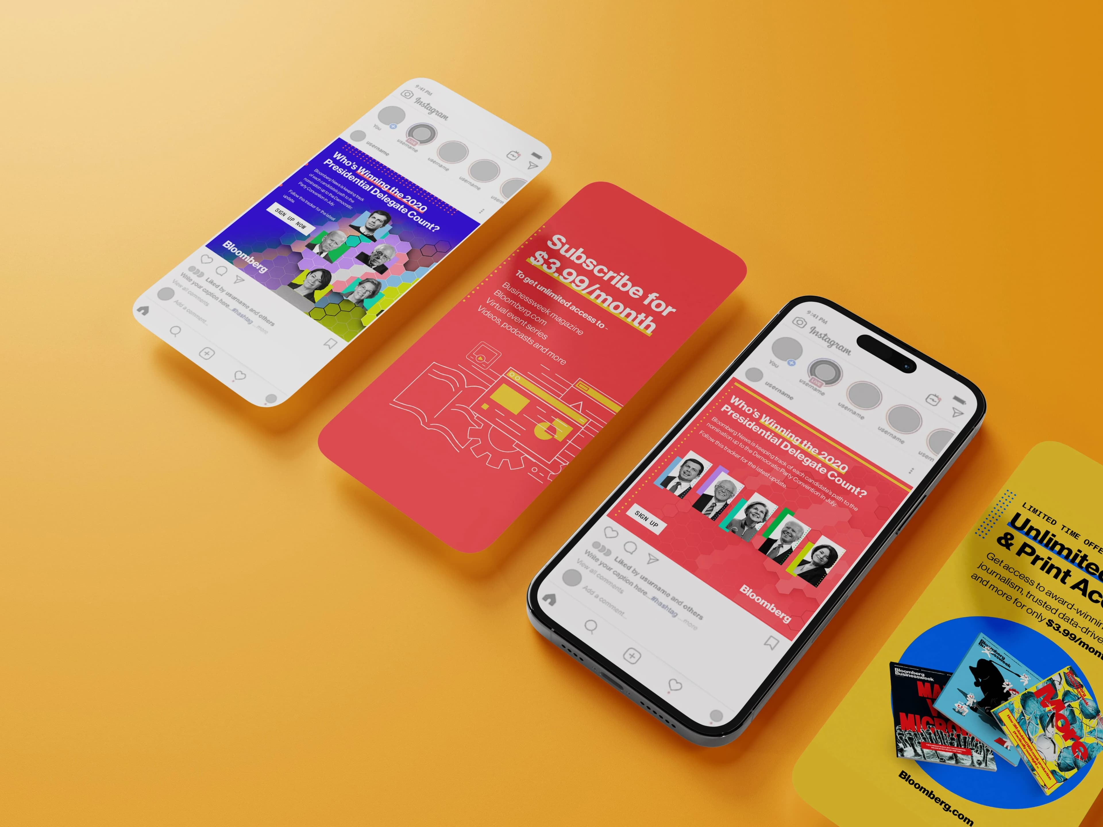
Bloomberg brought me in to art direct a run of advertising work across digital and out-of-home. They were rolling out new offers and discounts on the terminal, and they needed the campaign to feel as sharp as the product, lifting their online presence and pushing conversions. The brief was simple to say and hard to do. Take dense financial information and make it feel human, immediate, and worth stopping for. Every layout had to hold up at billboard scale and still land in a feed.
Approach
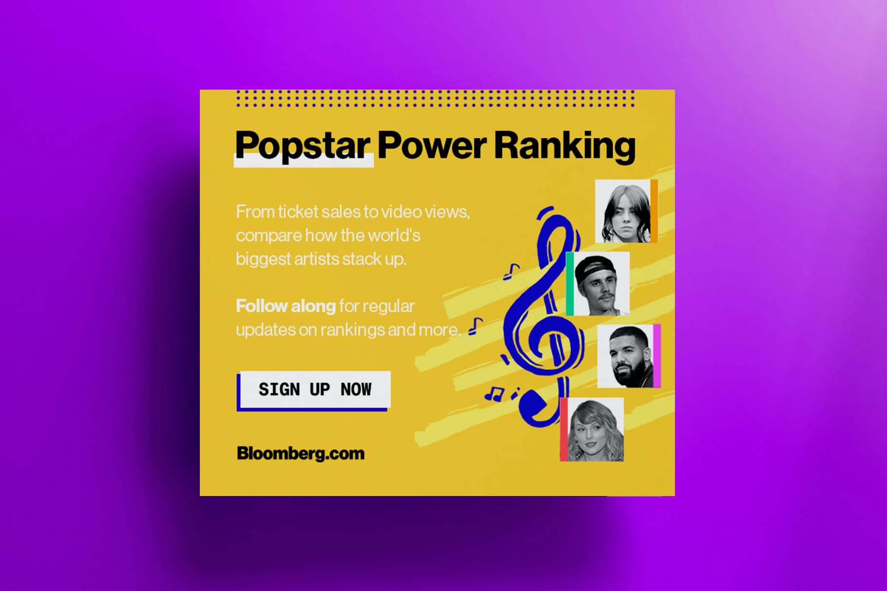
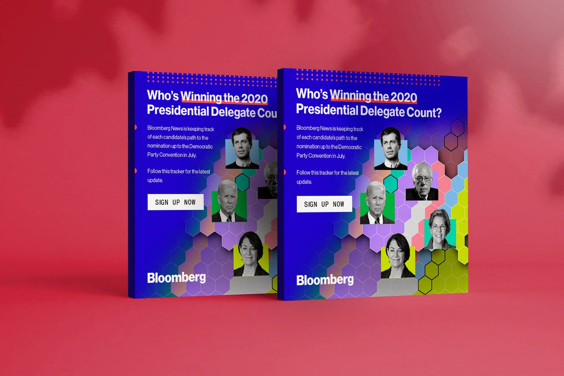
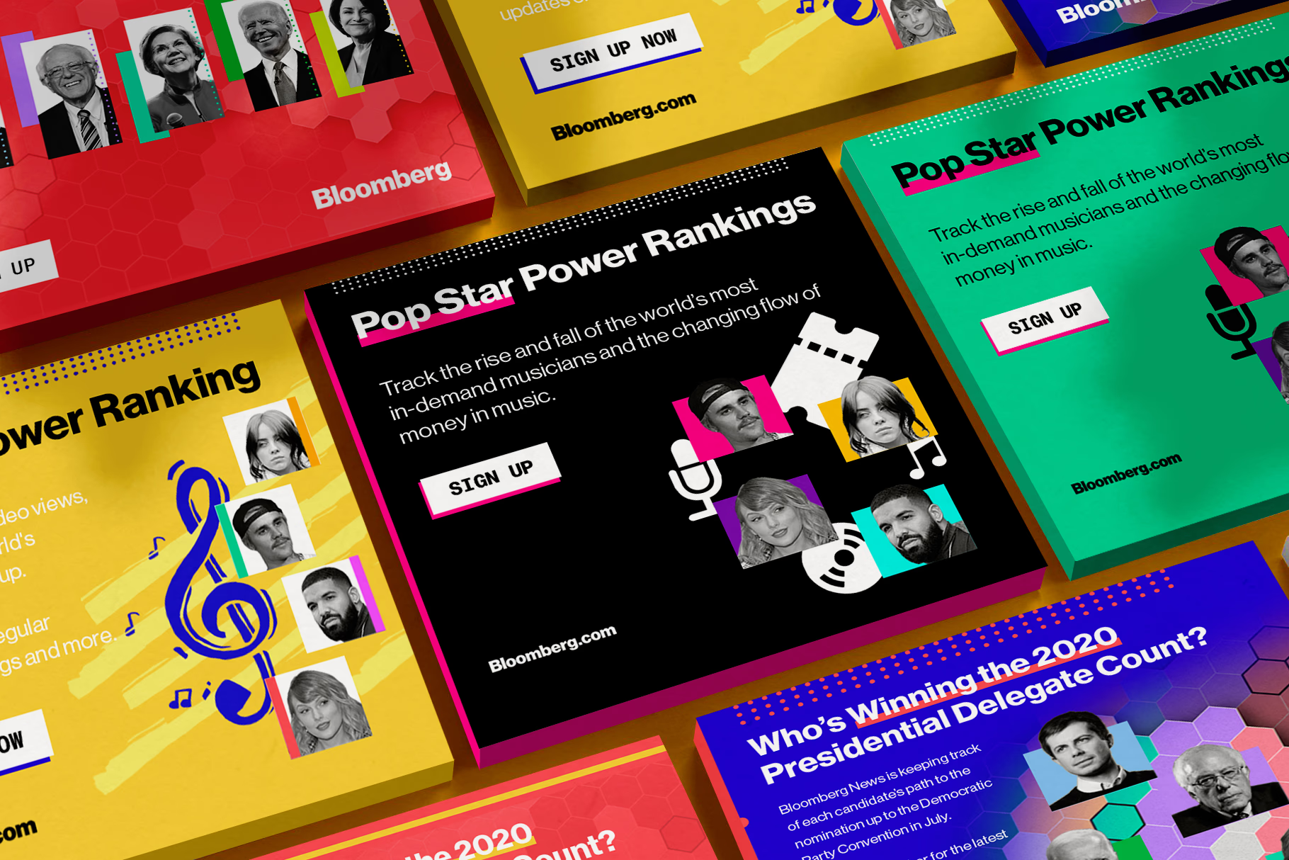
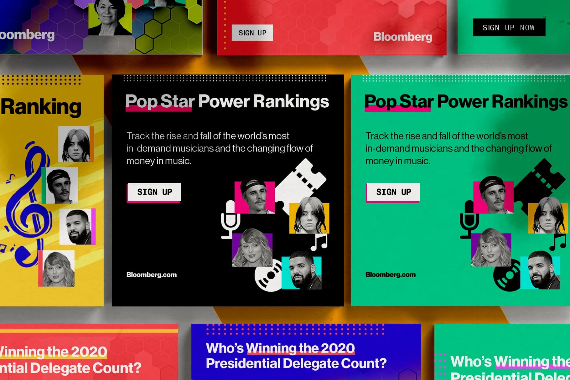
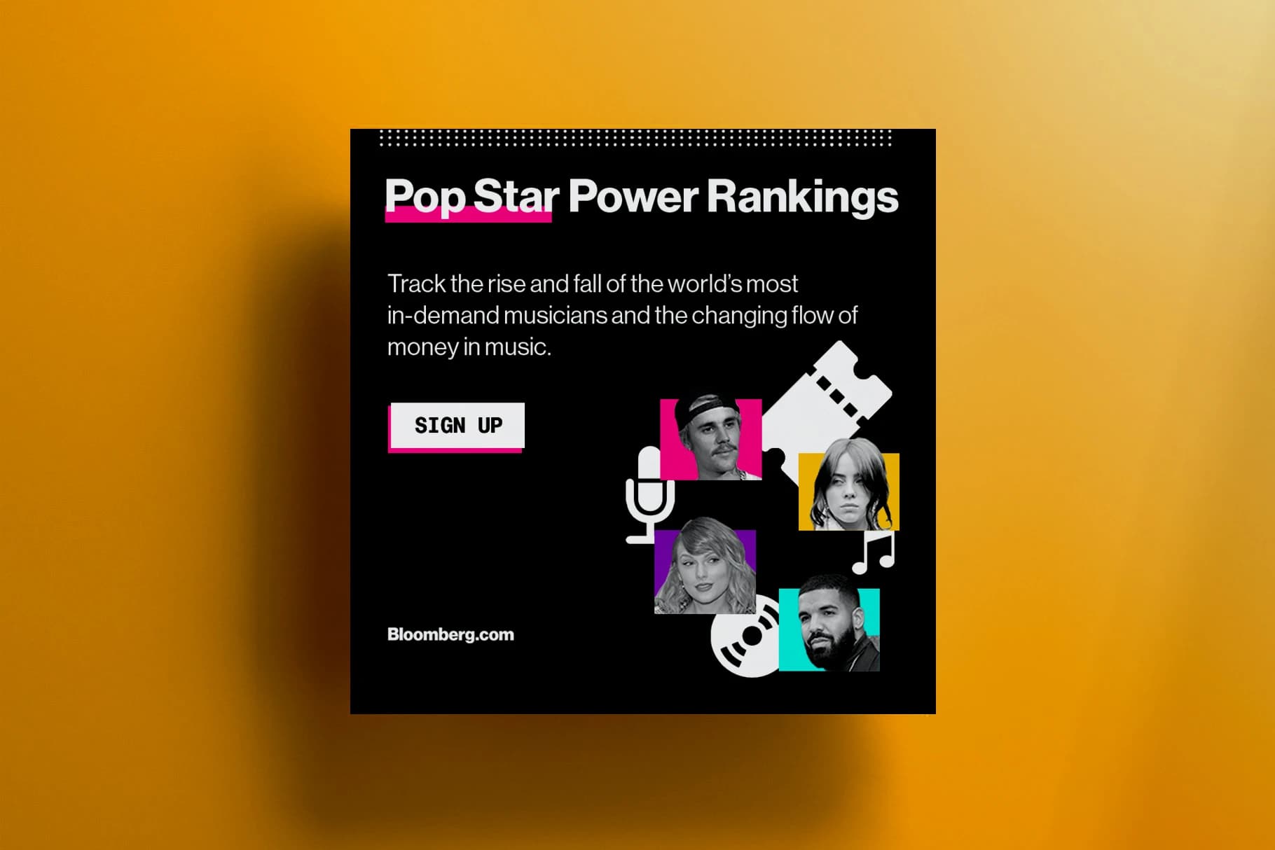
While Bloomberg’s style guide may appear minimalistic and monochromatic, their brand manual for promotional materials boasts an array of elegantly designed shapes in a vibrant spectrum of colors. This versatile approach successfully complements both light-hearted articles on pop culture icons like Justin Bieber, as well as weightier pieces on presidential elections and other serious subjects.

Outcome
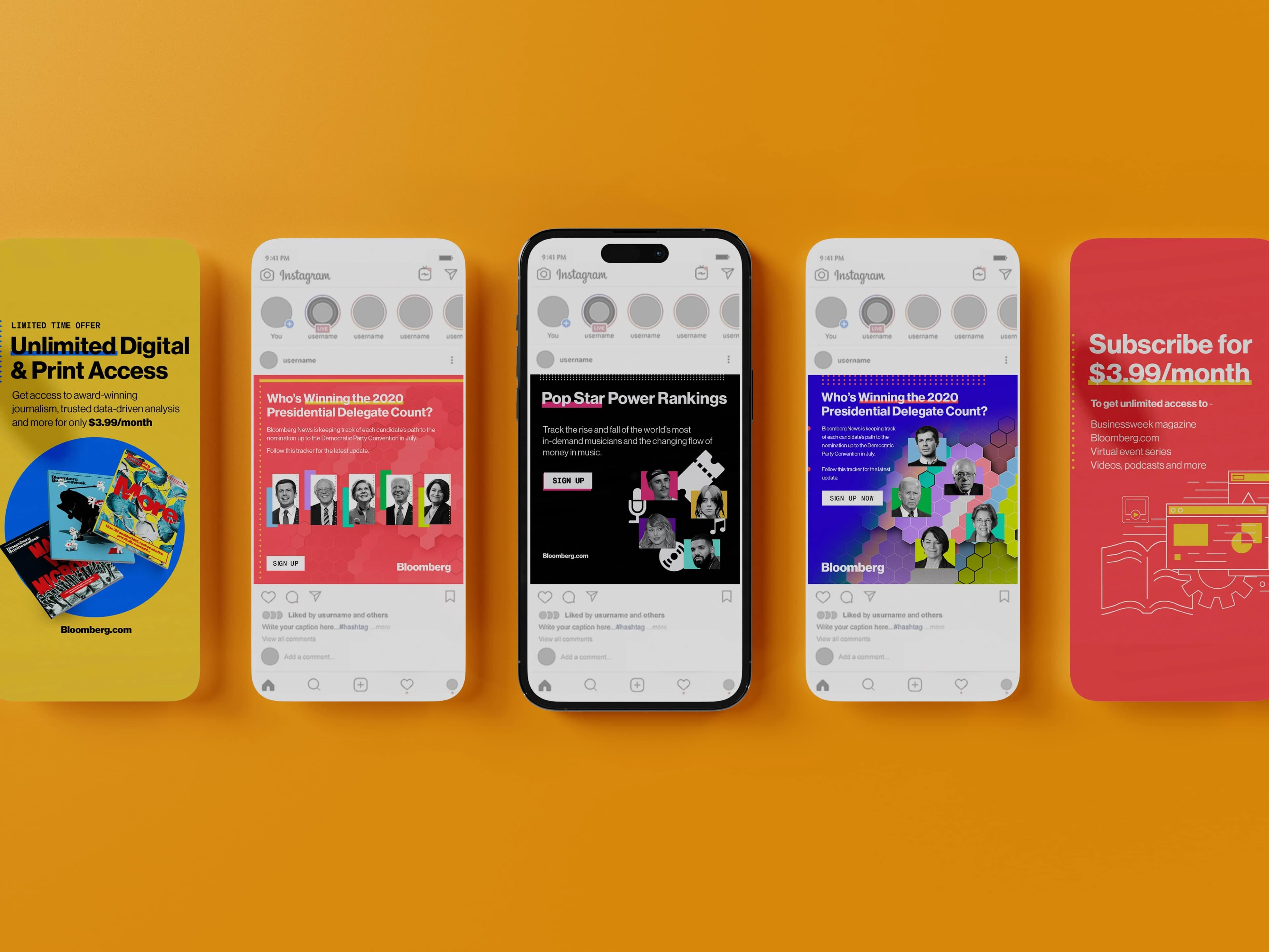
I built a flexible system of bold type, sharp grids, and high-contrast imagery that could flex across formats while staying unmistakably Bloomberg. This style would become the foundation for their promotional visual identity for several years.