AAA Fund(05)
Overview
The client’s goal was to build a brand identity that reflected AAA Fund’s strength, reliability, and commitment to fostering innovation. They aimed to establish themselves as a trusted venture capital firm with a distinctly American character. Objectives included increasing brand recognition and attracting visionary entrepreneurs.
Approach
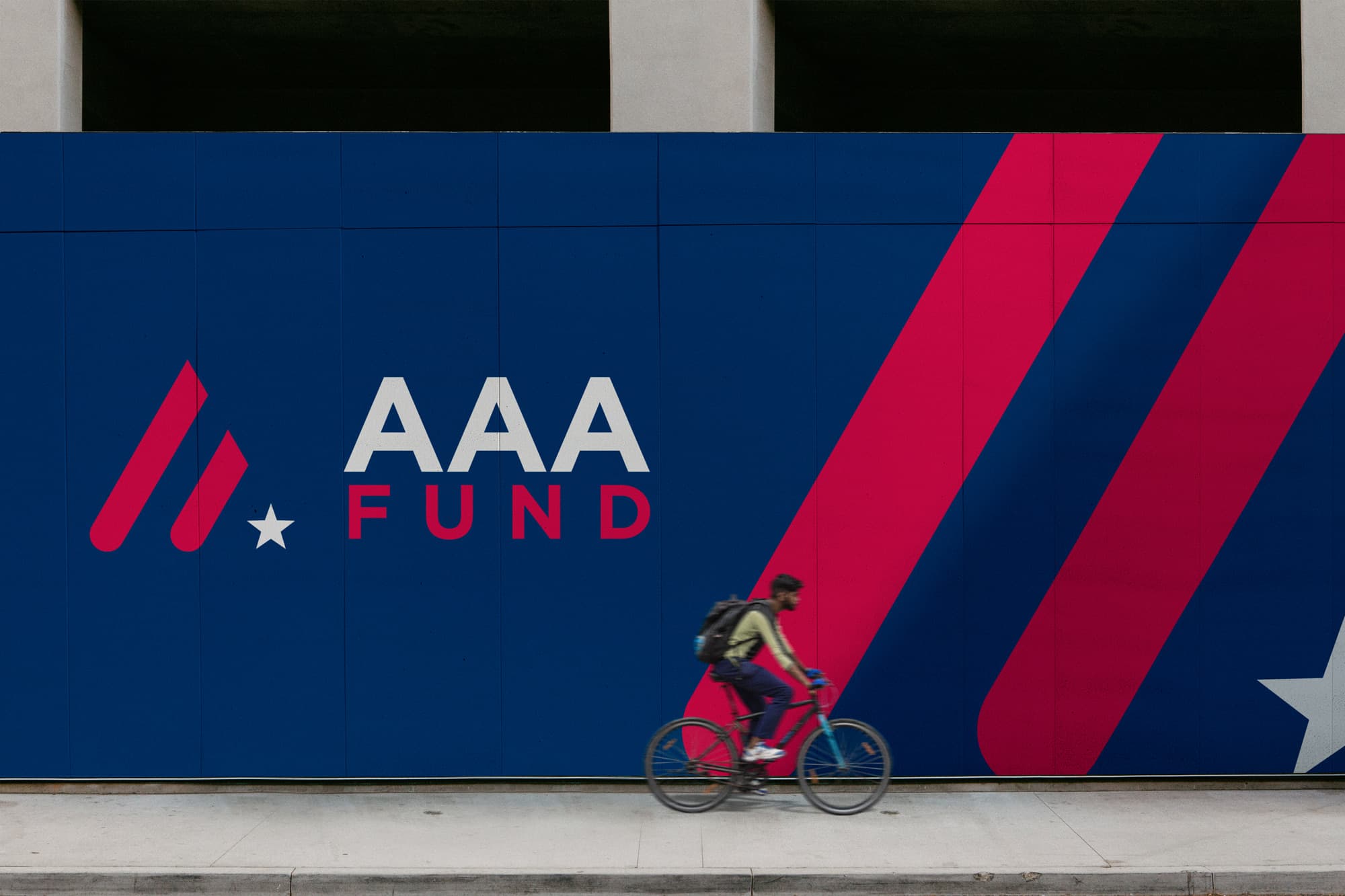
The approach was to create a brand identity that embodied confidence, stability, and forward-thinking investment. The design leaned into a bold yet refined aesthetic, incorporating elements that reinforced AAA Fund’s American foundation while setting them apart in the competitive venture capital landscape.

Outcome
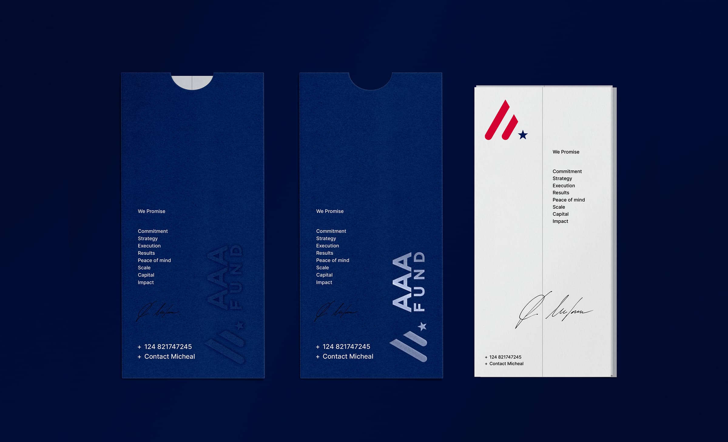
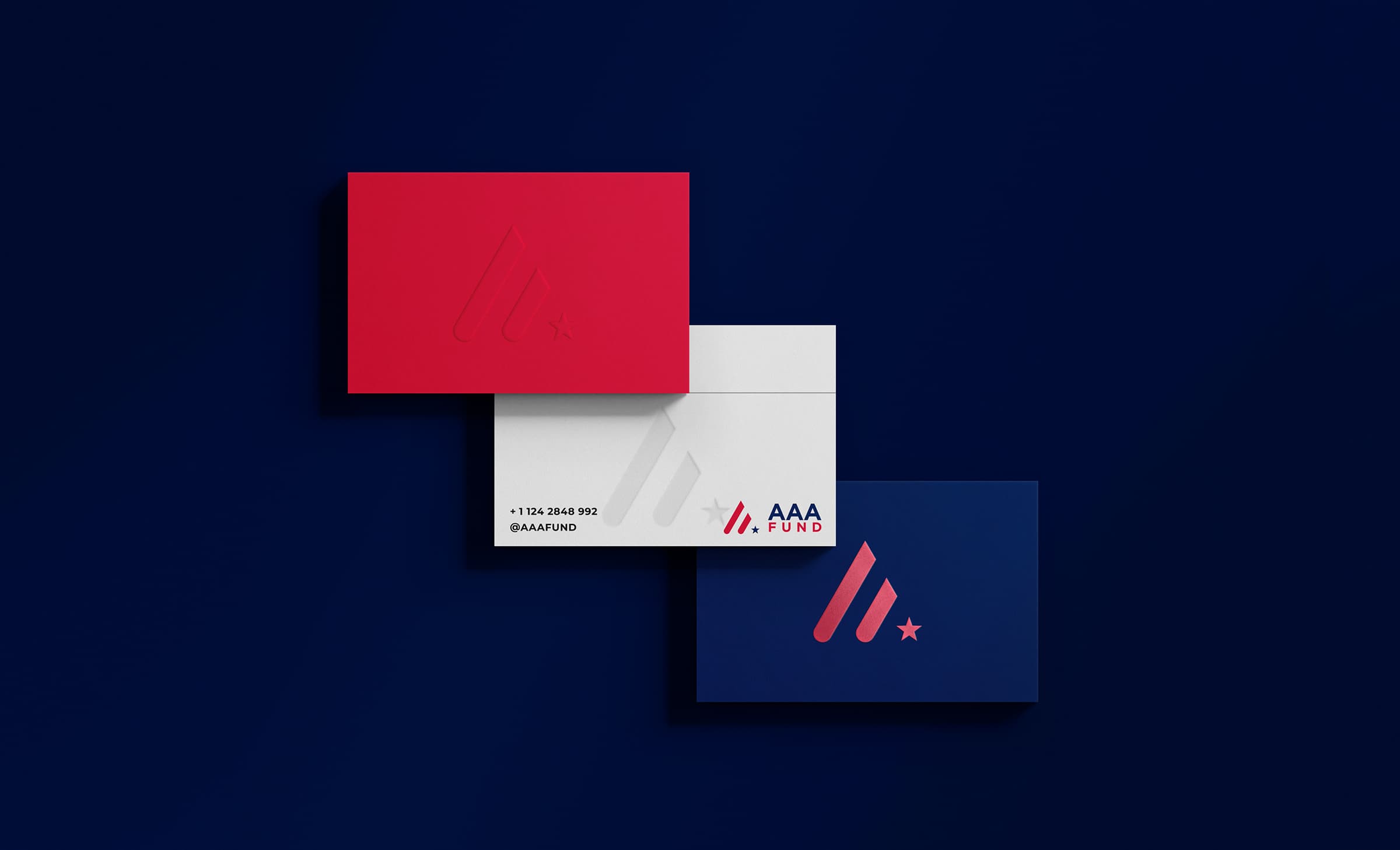
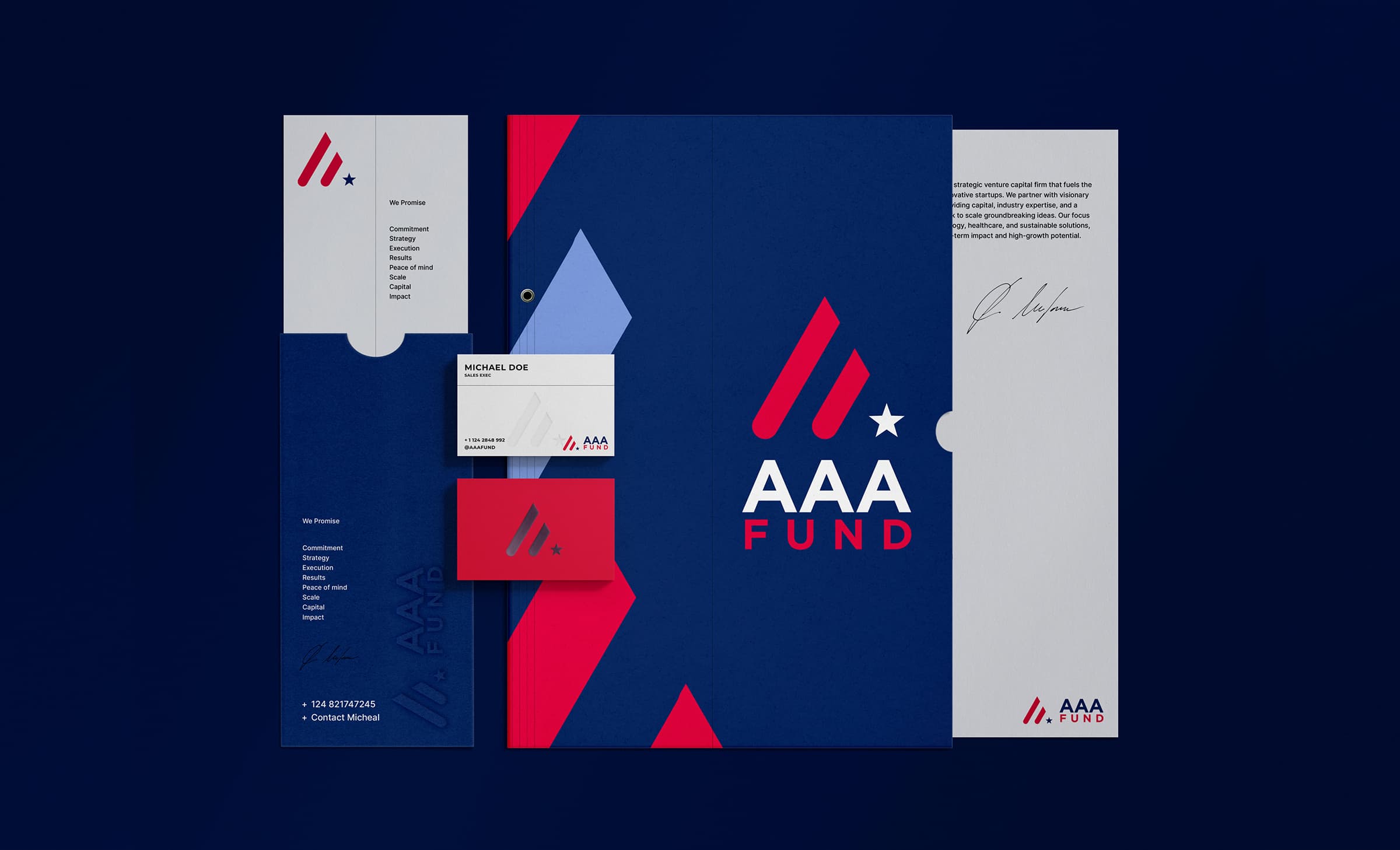
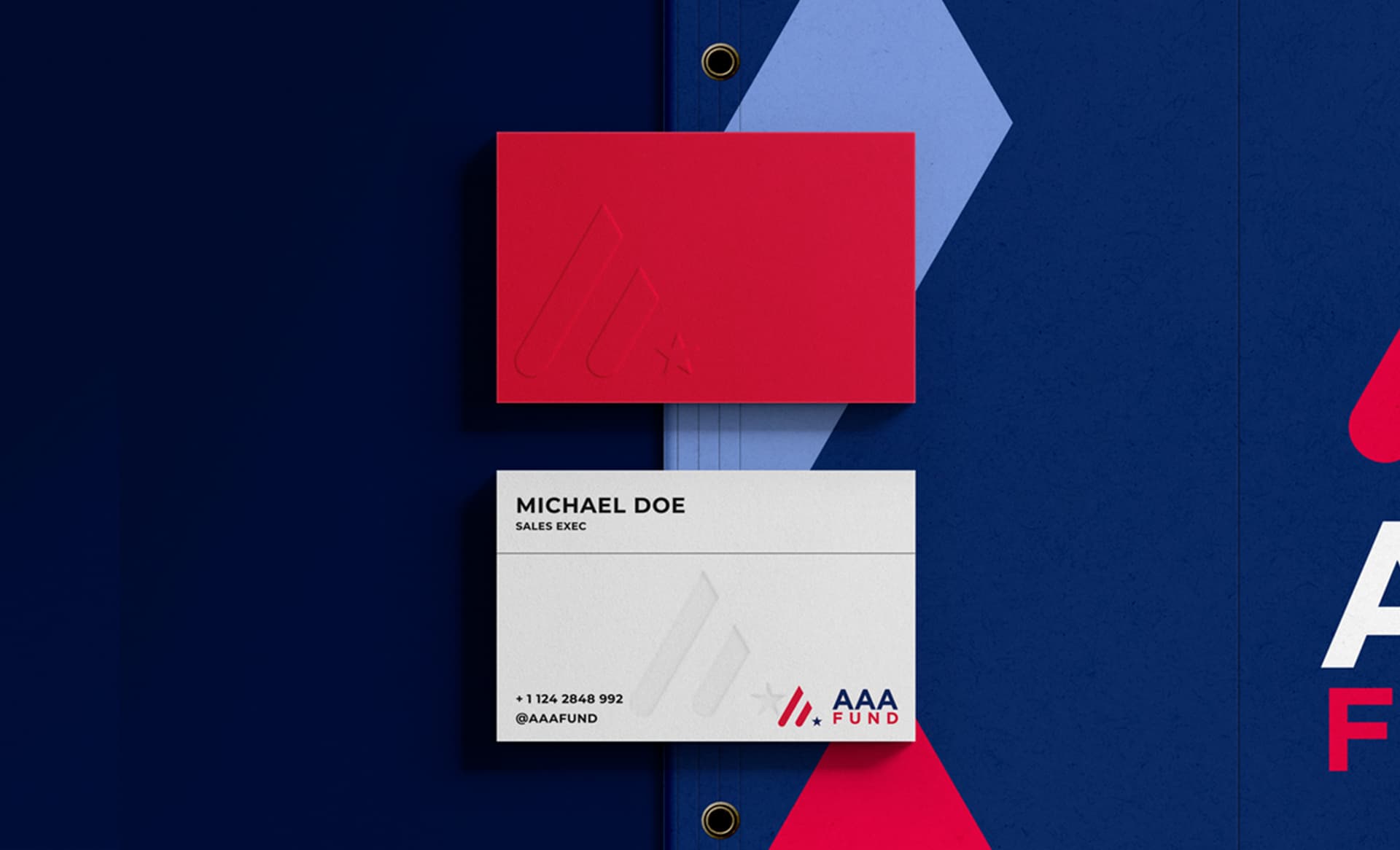
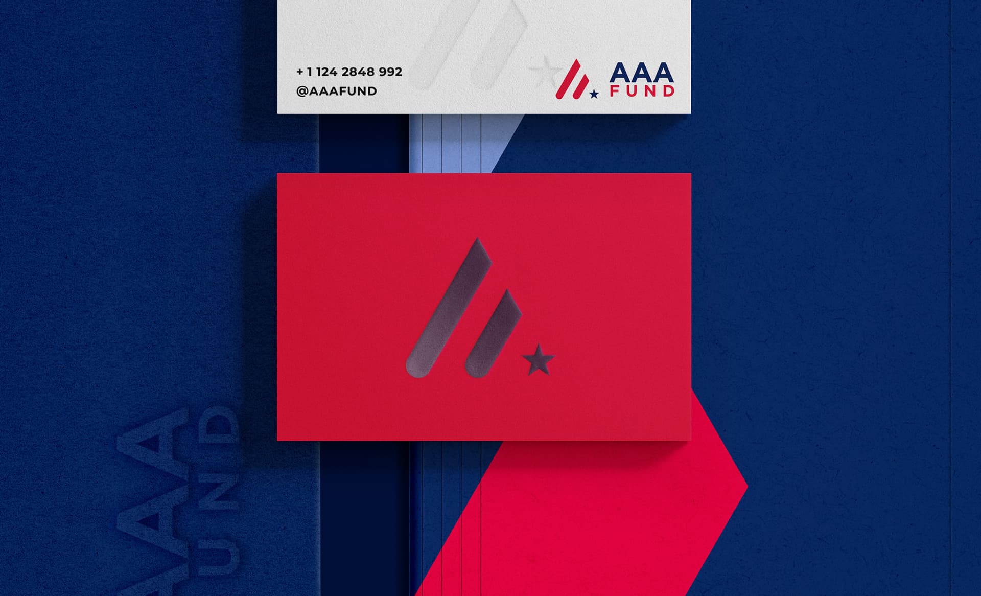
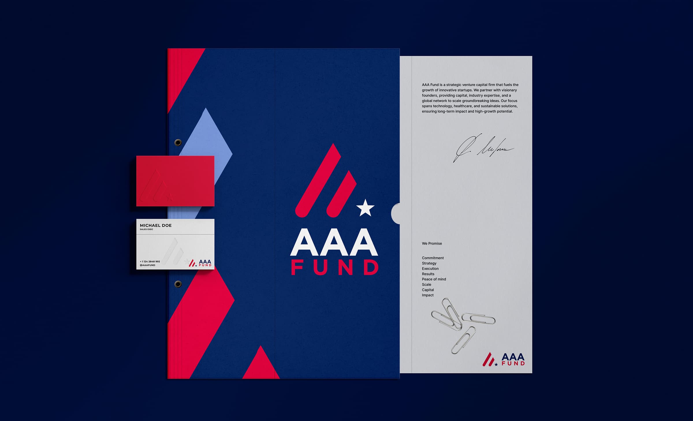
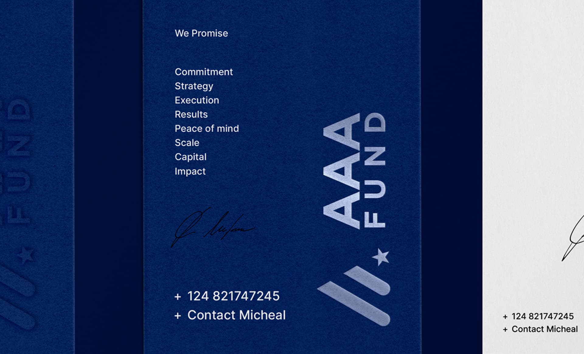
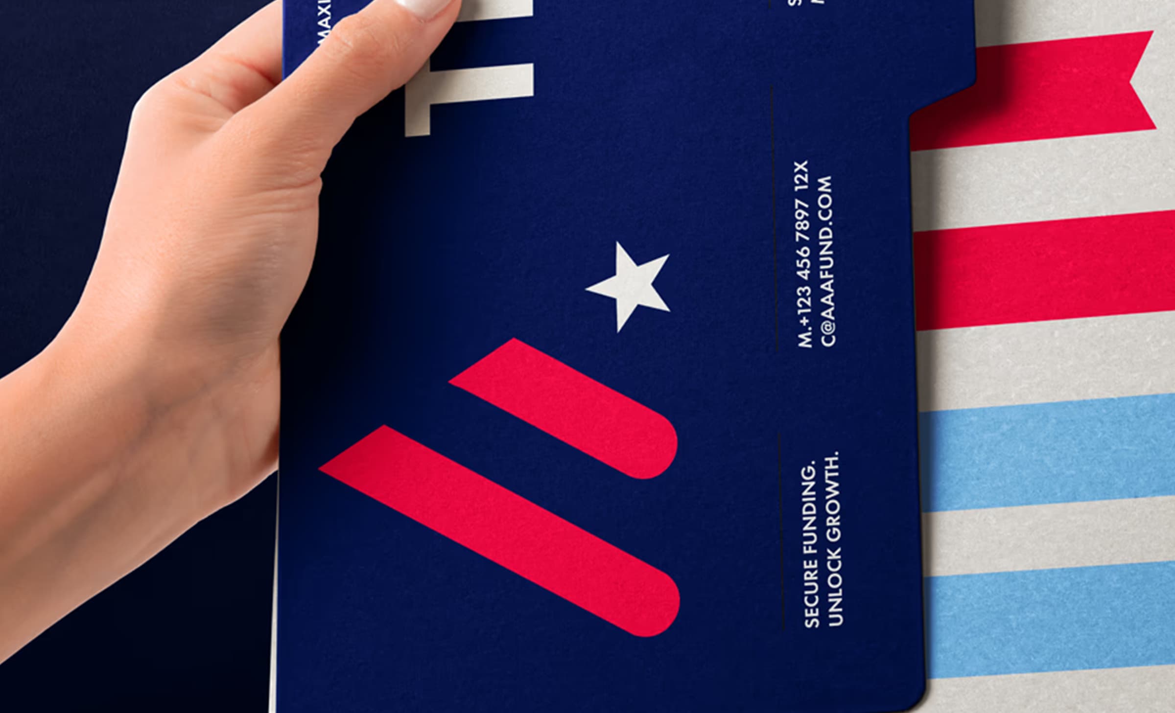
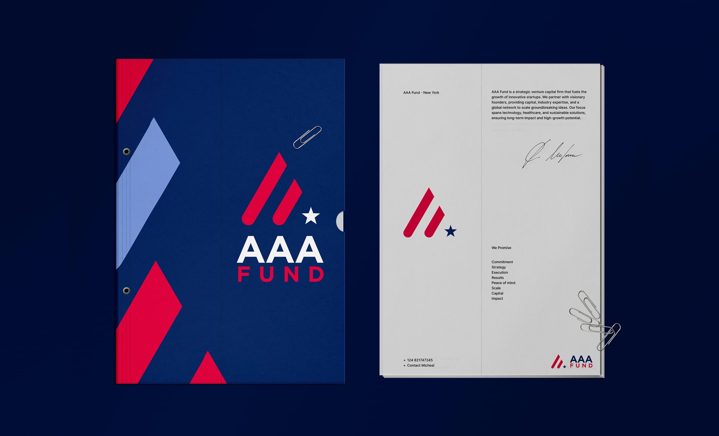
The mark does the talking. Two strokes rising left to right, a small star tucked at the base, and you have growth and America in one gesture without a flag in sight. I paired it with a deep navy, one hard red, and a wide uppercase wordmark. On paper it gets the full treatment. Blind embossing on the cards, foil on the envelopes, a folder with a thumb-cut notch. It looks like a firm that has been doing this for a long time.